What have all great logos in common? All great logos have different shapes, colors, fonts, sizes, and structures (letters only, letters + graphics, or just graphics) but even if they are so different, they have many characteristics in common.
We have identified several characteristics and for each, we will show you in examples.
4 characteristics that all great logos have in common
1) They respect specific rules and ideas.

Great logos are not just drawn, they have been created following specific rules.
- Why Apple? Because it is a common and not aggressive name, easy to pronounce and memorize. Who doesn’t like apples?
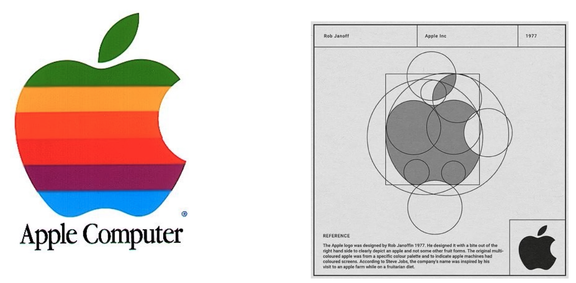
- Do you know why the apple has the bite on? If the bite wasn’t there, the apple could be mistaken for a cherry. This way it is clear that there is an apple.
- The Golden Ration – In mathematics, two quantities are in the golden ratio if their ratio is the same as the ratio of their sum to the larger of the two quantities.
It is believed that Apple Logo is respecting the Golden Ratio.
2)The story behind the creation of these logos.

Great logos have a story and people love stories.
If you are creating right now a logo, imagine yourself being uber successful, in front of millions of people (articles on 5 most reputable online publications), explaining the story behind your logo.
You need a story, prepare for that moment from the very first start.
Were people back then thinking like this? No, but then it was much more complicated to get a logo than today and that is why people were actually working hard to succeed.
Here is the story about Nike’s logo.
The name – Nike is the Greek goddess of victory. The goddess was an inspiration to Greek warriors. When the warriors won a war, they used the say ‘Nike’ to each others
The Swoosh – Originally, the logo was called as ‘the stripe’, which later became well known as ‘Swoosh’. Swoosh referred to the fibers that the Nike shoes used that time. The Nike swoosh logo made its first public appearance on the shoes in the spring of 1972. At that time, the Nike symbol was printed on the vamp of an athletic shoe.
The Swoosh is a sound that we hear when something zips past quickly by our side. This word stands for fast sound, speed, and motion. This is the reason that the logo is in a shape that shows an arch of movement.
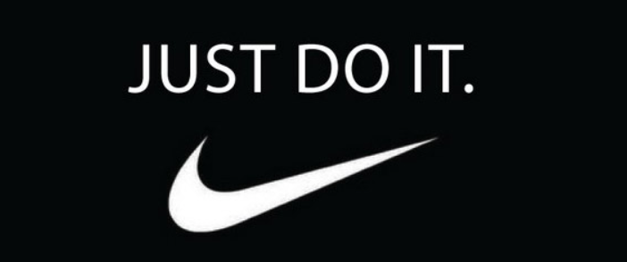
The slogan and the font – The slogan “Just do it” is known by the whole world, being invented in 1988 and never changed since.

What font is the slogan using? How can we identify it with easiness?
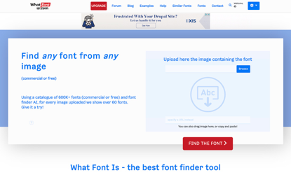
Upload the picture to WhatFontIs – the best font finder – and in just a few steps you will find out. This is the only font finder that has indexed over 600k fonts, that identifies both free and paid fonts, and that is working with all font foundries, including Google Fonts.

Step 1 – You upload the picture.
Step 2 – You write down the characters identified by the powerful AI. If you are a registered user, ignore this step, the software will do it automatically for you.
Step 3 – At this step the software identified the font for you and provided you the following info:
The name of the font.
The price (maybe it is free).
The download links.
Over 60 free and paid alternatives.
The font appears to be Futura Bold Condensed Oblique with minor tweaks. There is some slanting of the letter K to make the text distinctive and visible. Nike was written on the logo in Futura bold until 1995.
All the elements of the logo blend together perfectly
Great logos have all the elements blend together perfectly. The shape matches the size, the colors, the font, the message, and the graphics.
Seems easy? It is for the naked eye but expert graphic designers pay huge attention to this. Remember the golden ratio of the Apple logo?
Check Google logo. Is it perfect? Yes, from many points of view. And it looks so simple, like we could all do such a logo in 10 minutes.
Why did they used 4 colors while experts say that logo should have max 3 colors?
Ruth Kedar, the graphic designer who developed the now-famous logo said: “We ended up with the primary colors, but instead of having the pattern go in order, we put a secondary color on the L, which brought back the idea that Google doesn’t follow the rules.”
Great logos are bold
We discussed about 3 logos in this article: Apple, Nike, and Google.
All these 3 logos are bold.
Here is why:
Apple
Would you have named your company Apple? I would not.
Would you have designed your logo as a bitten apple? I would not.
Apple logo is simple, too simple.
Nike
I find the Nike logo extremely simple but very powerful and simple to remember.
Their slogan is outstanding but also its history. Nike’s iconic “Just Do It” slogan was inspired by the final words of a notorious killer in 1970s Utah.
Google
4 colors used in the logo specifically to break the rules. I like this very much.
Think outside of the box and take bold decisions for your logo design.
Conclusions
To answer the question from the very first start of this article – What have all great logos in common – there are 4 characteristics that we detailed above.
If you want a great logo design for your business, have in mind these characteristics and the two tools that can help with your logo creations:
LogoAi – one of the top 5 logo makers for 2020 which can help you design a logo, create matching business card in less than 10 minutes.
WhatFontIs – will help you identify fonts from any picture. Use great fonts for your logos.
48hourslogo – the most affordable logo design contest for small businesses
