Today, it should come as no surprise that logos significantly impact a business’s success. That’s why you need to ensure you have the right logo to represent your brand. One of the challenges business owners face when it comes to logo design is size.
When it comes to the right sizes of the logo, it actually depends. When you are designing the logo you got to keep in mind the variety of the platforms where your logo will be used. The standard logo size will depend on the platform where you’ll upload it. That’s why it’s essential to have easy-to-resize PNG and vector files so the logo will be able to adapt easily.
Therefore, you need to ensure your logo design can work on different platforms. Check out these logo size guidelines!
The Logo Size Basics
There are two things you need to make sure if you want to create the best logo — they need to be resizable and can be used in various contexts. With that, logo design calls for creating variations so you can fit them easily into everything!
Your logo must be scalable, so even if you put it on a billboard, the logo will still look clean and clear.
Remember, logos are measured in pixels. This means you’ll usually see them referred to in dimensions. Also, vector files are important because they will serve as master files you can scale, edit, or send to your designer or printer.
It’s also a good idea to have different logo versions: horizontal, vertical, and square. These are the variations that will let you place your logo almost anywhere.
You should also use a PNG file to display your logo online and make sure it’s less than 200KB, and if it’s larger, you may need to adjust your digital images to reduce their size. That way, you can guarantee it will load fast while it stays sharp.
The Logo Size For Websites
There is no website without your logo, and every website is unique. Therefore, the right logo size to use will depend on where you will place it on your website. One thing’s for sure, though, make sure it’s in PNG format for easier application.
If you have the logo in your site header, the size will depend on the site builder and the theme. The average height to use here is between 20px and 30px, while the width depends on how long your brand name is.
Now, when you use it for your favicon, the standard sizes are 16px x 16px. There are factors you need to consider for social media, such as profile photos, cover photos, and banners. Therefore, you need to consider all of these when placing a logo because you want to ensure the logo will be detailed, clear, and seen perfectly.
Sizes For Social Networks – Must Have It!
Social networks are a space that requires well-defined sizes for downloadable graphics solutions such as profiles and covers. Every social network has precisely defined sizes.
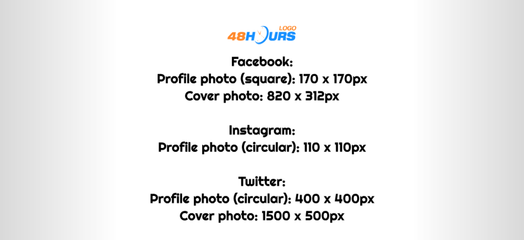
As for the size of the logo within these graphic solutions, it is a matter of your decision, but of course, the size of the logo must be consistent with the given sizes dictated by social networks. Therefore, here are some of the most popular social networks and their sizes.
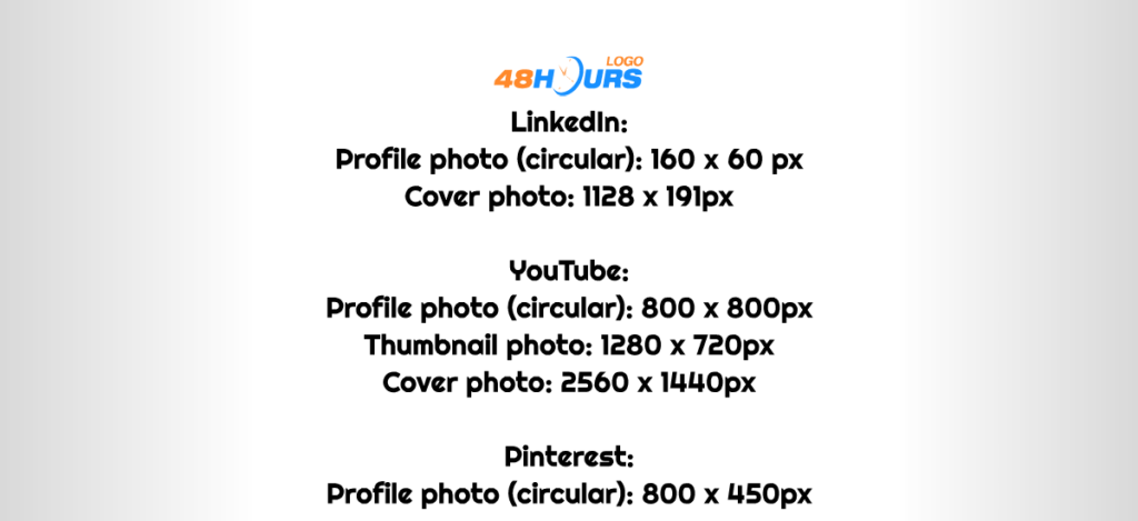
We focus here on the so-called “profile” and “cover” graphic solutions because these are the places where you will apply the logo.
Facebook:
Profile photo (square): 170 х 170px
Cover photo: 820 x 312px
Instagram:
Profile photo (circular): 110 x 110px
Twitter:
Profile photo (circular): 400 x 400px
Cover photo: 1500 х 500px
LinkedIn:
Profile photo (circular): 160 х 60 px
Cover photo: 1128 x 191px
YouTube:
Profile photo (circular): 800 x 800px
Thumbnail photo: 1280 x 720px
Cover photo: 2560 x 1440px
Pinterest:
Profile photo (circular): 800 x 450px
Do different logo sizes lead to different logo layouts?
As we have said, depending on the platform on which the logo is used, its size also depends. One thing is the application of logos in print, another in the digital sphere such as a website, social networks, or mobile applications.
In general, statistics show that today most people access online content via mobile devices. Somewhere on average, about 70% to 80% of all traffic takes place via mobile devices.
The question is, do you need different layouts in addition to different logo sizes? The short answer is yes! It’s like arranging your own wall picture tiles: spacing matters in different scenarios.
Simply put, it’s about the visibility of the logo. The space provided for the logo on social networks or mobile applications is far less than the space we have in use when it comes to, for example, printed formats.
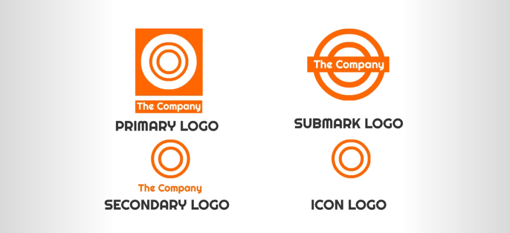
That is why we have a division of the logo into several basic layout variants. Primary logo, secondary logo, submark logo, and icon logo.
Namely, these layouts were initiated partly by the need for different sizes, but also partly due to the need for different types of brand communication, ie branding.
The primary logo is the most basic logo – the main logo. It contains the layout that is most commonly used, the company name, that is, the brand name, and the basic element of the logo.
The secondary logo is a customized, simplified, and slightly modified logo. In general, the changes are small, and despite the different layout of the letters of the company name, most often the logo element itself is reduced or placed differently.
Submark logo is an extremely simplified logo that retains the name of the company, ie the brand, in its concept. Or at the very least, it retains the initials of the company name in its concept. Its use-value is especially emphasized where good fit is needed in small spaces, spaces such as social networks profile images, or mobile apps.
Icon logo, or as it is often called “brand element”, ie, in the slang of web designers “favicon”, is the simplest variation of the logo and it is actually just the basic element of the logo.
Definition of the size of the logo in the design brief on 48HoursLogo.Com?
When launching a design contest, the first step is to write a design brief and be as precise as possible, because that way you will get the best possible solutions.
Do not hesitate to describe in more detail the way you will use the logo the most. This will help our designers better understand the nature of your business and the philosophy of your brand.
Your design contest is an opportunity to get dozens of amazing solutions, so avoid the mistake of not having a good description of your wishes and tell about your company as much as possible. The process of the design contest on 48HoursLogo is very simple, but this thing depends on you! So, make it good.
Require your logo to be made in four basic layout variations. No matter what size you would need, you will have an appropriate layout to use. As we said, these are the primary, secondary, submark, and icon logos. All four variants should be delivered to you in basic formats, of course including the most important format, the vector format.
We emphasize that the most important format is the vector format because you can easily export any size from it, so you do not need to bid here with the exact size of the logo – just describe the application ways of your future logo, and leave the rest to the designers. The size of the logo itself is relative, you will use the logo in different circumstances. Even in the development of a website, for example, a logo can be smaller or larger – extremely relative. It is important that you get the basic formats (PNG, SVG, EPS, and PDF) and in the first place the vector format.
Also, list the social networks that your company uses or plans to use, the designer can then know the exact size or at least the most accurate logo size that you can use within the graphics solutions for those social networks.
What is important is that you have different basic layout variants, so regardless of the size you need – you have a layout variant, that is, the best possible solution that you will apply. For example, if you need a small logo for a mobile app, there is a submark or icon logo.
By requiring the logo to be done in basic layout variants, you ensure yourself by getting solutions that you will be able to use on all possible platforms in the best possible way. Good luck!
