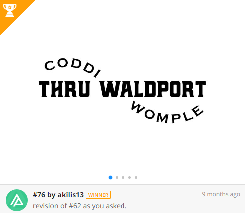
Text-based logos are those logos that contain only the name of the company (or brand) without any other elements, or contain – absolutely minimally – other elements, but only at the level of simple stylization.
You have many examples of text-based logos on our site, and in this article, we answer the question of “when using this approach in logo design is a good decision”?!
Text-based logos types
Text-based logos could be divided into two types. Lettermarks and Wordmarks.
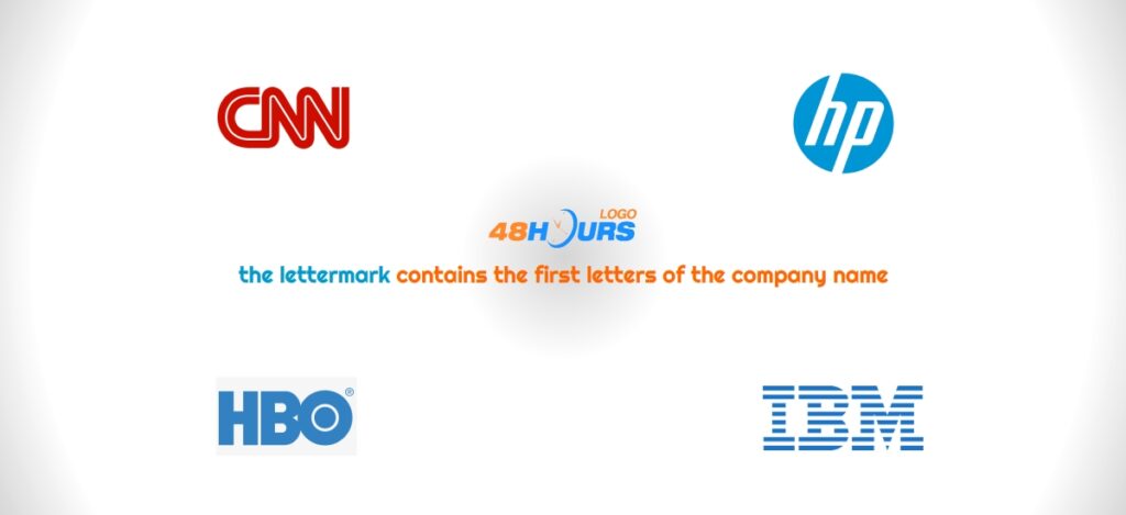
The first are initialisms, see our previous article for more information on initialisms, and in short – the lettermark contains the first letters of the company name. Examples of such logos are IBM, HP, GE, CNN, etc.
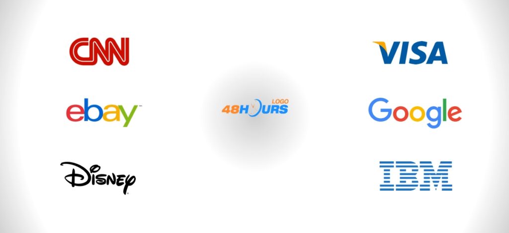
Another text-based logo is the wordmark which contains the full name of the company, examples of such logos are Google, New York Times, Sony, etc.
When to use a “lettermark” logo concept?
Lettermark is a good solution if your company name is long. Initialisms will make the company’s name easier to remember, and in addition will simplify the design, but also give recognizability and special power that initialisms carry. Initialisms have the power to give sonority and iconicness to a brand, reflect its strength and create the impression of a powerful brand. For instance, companies offering specialized services like EssayPro dissertation services benefit from a recognizable and adaptable logo that maintains its impact across various mediums.
Lettermark is also good because it is widely applicable and you will not have a problem regardless of the platform on which such a logo is used. Even in the smallest format and size, it will look great. This also applies to the wordmark.
It should be borne in mind that logos are increasingly used on platforms where visibility is narrowed, and in the first place we should keep in mind mobile devices and social networks where people consume the most advertisements and see company logos. Effective use of letter marks can enhance your brand’s presence across various social media platforms like Facebook, Twitter, and Instagram. This not only helps in maintaining a consistent brand identity but also makes it easier to get Instagram followers and engage with a broader audience.
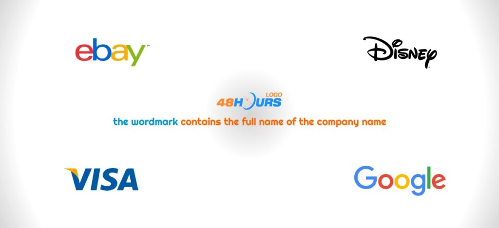
When to use “wordmark” logo concept?
Wordmark is recommended for all those brands that simply want to highlight the name of their company or brand. Put the company name under the spotlight – very easy!
If you are a new company, then you should consider the wordmark!
If you are an e-commerce business or online shop, then highlighting your web domain is an excellent idea! So, don’t think twice… wordmark!
It is especially consistent with the names of companies that are unique and different in themselves. In that case, the company, in creating the logo, should use the strength and uniqueness that a certain name has in itself. No doubt, the wordmark concept is the best for this.
Wordmark is first and foremost an acceptable and good solution for brands whose name contains one word, in which case we have exploited the full effect, and for names of two or more words, the concept of lettermark certainly takes precedence.
Of course, there are no strict rules, so wordmark that contains two or more words can be a great solution. Our experienced designers will hit you on a design contest with dozens of different solutions and they will help you make the final decision.
The advantages of minimal text logos (lettermarks & wordmarks)!
- A text-based logo remains legible and visible even when it’s scaled-down.
- A text-based logo is applicable in an easy way on many different platforms.
- A text-based logo is not cluttered and drowned with graphics, shapes, and patterns.
Here are some of the examples of minimal text logos from 48HoursLogo.Com!
