Targeting a wide profile of people, the design of the golf logo is based on simple and direct communication. It includes common elements such as “golf ball, golf club (sticks), greenery, natural environment”. As for color, green dominates.
Golf is also a luxury and often the design is stylistically determined in that direction.
Sharing experiences and know-how is always useful and inspiring. We present some of the golf logo design contests from our platform!
AGolfLesson Logo Design Contest

It’s the website for people to choose their golf instructor.
The client used the “design samples” option on our platform and we can see that he strives for minimalism and simplicity. A more modern expression.
The client received 94 creative solutions from our designers, and the winning solution is “simple” and “modern”, as the design brief defines.
Winning Logo Design Solution

The designer that won this logo design contest was AisRafa
The winning logo is pleasing to the eye. The logo carries a strong “call-to-action” frequency, it’s eye-catchy and radiates a positively sporty enthusiastic style.
The stylization of the letter A is an excellent creative moment and a very good idea.
Uses simplicity in order to address and target a wide profile of people. Love for nature as an element is expressed by the application of green, which is important for the largest percentage of the target audience.
The logo directly and clearly represents the business. The functionality of the logo is excellent.
Some of the other solutions…





Golfing Focus Logo Design Contest
The client had his own logo design, but he wanted the solution to be improved by professional designers.
The design brief defines a few simple things, suggesting the possible use of strapline, and when it comes to colors, the client wrote that he prefers “stronger colors rather than soft palette colors”.
The client received 227 logo design solutions.
Winning Logo Design Solution

The winner of this logo design contest was bigboss
It’s a logo with a very interesting and well-balanced combination of green and red.
This flag is waving very loudly here! The functional use of symbols, in that sense, is excellent. The logo is noticeable, has a strong eye-catchy moment, and communicates well.
Very good composition of elements and colors.
Some of the other solutions…





Golf Island Logo Design Contest

Golf Island is a Virtual Golf bar. Drinks, food, golf, retail sales of clubs, and apparel. The client described his business very briefly, but he still singled out a few key things that are important to him.
The logo should be simple and easy to see. No negative fonts. And the colors should be distinctive and clear. The client gave a basic frame.
Our designers have created 114 creative solutions for Golf Island.
Winning Logo Design Solution
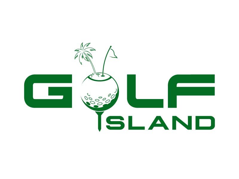
The designer that won this contest was axel182
A very vivid solution leveled through the application of solid green color that gives the logo stylistic seriousness.
The creative combination includes several elements such as a flag, a ball, and a palm tree, and with the inscription in the “display” style, very positive energy is achieved.
It is interesting that the logo is not simple at all due to the use of several symbols and elements, and although the simplicity of the logo is defined in the design brief, this logo – as such a complex logo – won. Applying one tone of green is what brings simplicity.
Some of the other solutions…

