Furious as bulls. We often get that impression about boxers when we watch a boxing match. Maybe that’s why red is a common element in boxing logo design.
We explore boxing logo design through examples on the 48HoursLogo platform to identify some basic characteristics of the boxing logo design. We believe it will be useful to all those who take on the challenge of creating and designing a boxing logo.
Common elements in the design of this type of logo are boxing gloves, red color, and the concept of a badge logo in the shape of a circle. Let’s look at some of the examples!
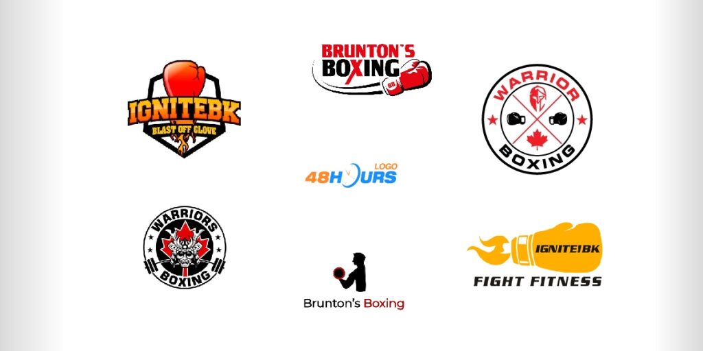
IGNITEBK Logo Design Contest
IgniteBK is a multidisciplinary entity dealing with boxing, kickboxing, MMA, and fitness. The client had design samples as representations of what the logo should look like and had two simple requirements. Colors to be black, red, and yellow, as well as to have the tagline “Blast Off Glove”.
On the 48HoursLogo platform, IGNITEBK received as many as 257 solutions. The client chose the winning one, but in addition to the winning solution, he bought another solution that he especially liked.
Winning Logo Design Solution
This solution deviates from the usual concept in which red predominates. The client mentioned black, red, and yellow in the design brief as colors he would like to see in the logo design solution, but in the end, he opted for the black/yellow combination as the winning solution.
The concept of the badge logo is understandable because this concept completely corresponds to the largest number of sports logos.
The logo communicates very well and is energetic with a strong call-to-action message.
Some of the other solutions…


Brunton’s Boxing Logo Design Contest
Fictitious Boxing Gym in a gaming universe. A very interesting combination of sports and gaming concepts that carries the need for special consideration for the target group.
The client had a very short brief design, which read “Classic Boxing Gym, Black and Red Colors”.
48HoursLogo designers offered 53 creative solutions.
Winning Logo Design Solution
Very simple, and we can freely say a classic boxing logo. Badge logo in the shape of a circle with a slightly retro style expressed through the font.
Clearly defined logo. Very good.
A common element of boxing gloves in the common badge logo concept. No mistake!
Some of the other solutions…
Warriors Boxing Logo Design Contest
Several determinants are listed in this design brief. Company name to be directly incorporated with the logo (not underneath or over top).
As for the colors, the client stated black and white, emphasizing that red could be accentuated.
The client also wrote the following. “We like the idea of the warrior being a samurai, specifically the helmet/mask, not the full body.”
What this company wanted was to point out that they are in Canada, so it was stated that recognizable Canadian maple leaves are a mandatory element.
The company received 104 logos on our platform.
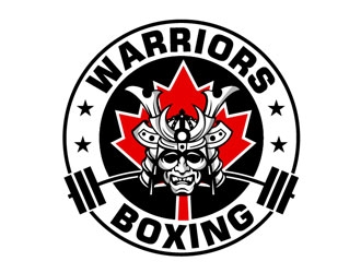
Winning Logo Design Solution

Looks like the client got exactly what he was looking for. He presented the idea well through clear instructions and with added design samples everything was additionally clearly explained.
The usual badge logo concept, but with a strong uniqueness through the placement of the “mystical samurai” character.
These elements give the logo its recognizability, which is very important.
The logo reflects the energy of power, strength, and adrenaline, and that is what is perfect for a logo of this type.
Some of the other solutions…
