When talking about logo design we all know the public should be able to get the brand message in a matter of seconds. Yet, having a logo with an extensive color palette or relying too heavily on color are widespread mistakes.
Color should be the last feature when making a new logo, mainly because a logo has to look good in black and white as well as color. That said, having the right hint is still important. And as a general rule, a logo design shouldn’t have more than 3 colors. Excessive use of color can cause confusion. In most cases, a logo design can’t make a good impact with a large mix of shades and hues.
Whatever product or service you offer, you must communicate your message with a simple design and an even simpler color palette. Harmony is about using the shades that fit together. Hence, the brain can easily process the design.
Making the wrong color choice or mixing many opposite colors could be a costly mistake.
In this article, we’re going to learn how to choose the right hints and why your logo design shouldn’t have more than 3 colors.
Simplicity as a rule of logo design
Color is essential to create consistency. So, in order to build consistency, you must avoid color discordant compositions or in other words, mixing together the wrong colors. How do we avoid that?
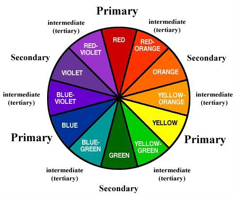
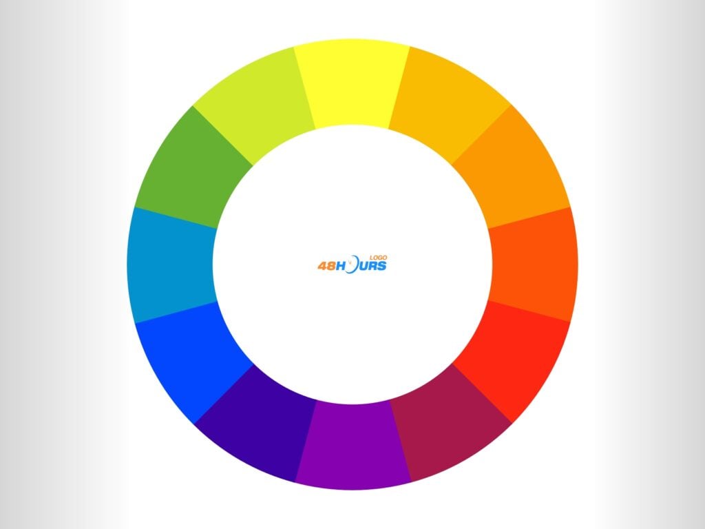
The color wheel is a good place to start. Every designer refers to the color wheel to create a balanced palette.
It’s important to know the relationship colors have with one another and what kind of combination works best for your brand. When launching your design contest, be free to emphasize the importance of a well-balanced color palette in your design brief. Our experienced designers will present you with dozens of them to choose from! Strong branding examples, like OnlyMonster, show how consistent design choices help businesses stand out.
The Colors Wheel: Primary, Secondary, Tertiary
The color wheel is divided into primary colors: red, yellow, and blue. By mixing two primary colors we obtain the secondary colors: orange, green, and violet. And mixing two primary colours take us to the tertiary colours: red-orange, yellow orange, yellow green, blue-green, blue-violet and red violet.
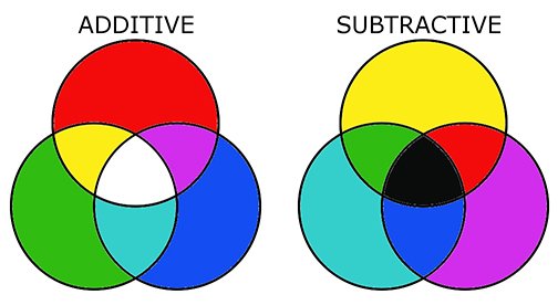
This way of mixing colors has been used by artists for centuries. And it’s known as a subtractive method, which basically means mixing colours just like a traditional artist.
But, there is another way of mixing colors and it’s known as the additive method, which refers to mixing colored light using a different set of primary colors: red, green, and blue. Commonly, used in computing programing and known as RGB.
Computers handle color differently, a web browser can only make up 256 combinations. Pixels don’t have enough bits to create all the color combinations. Besides, Mac and PC slightly change 40 of those 256 hints. So, once you know this you can start to think about how you can use colors effectively.
You may ask yourself where you’re more likely to use the logo, as certain colour combinations may differ on different platforms. If you want to create uniformity, try to see how the logo looks on a computer screen and on paper. Again, not all computers or TV screens handle color in the same way. It’s crucial to choose a color palette that doesn’t have big tone variations.
This is why designers advise not to use more than 3 colors. Apart from creating confusion, you may damage the design and the message behind it. It’s extremely difficult to manage a rich design all through a wide range of platforms. Thankfully, there are some combinations that can enhance your brand. We said colors relate to one another. Quite often they are grouped according to their temperature.
Types of colors
Warm colors:
Warm colors are those with a high red value. They sit next to each other on the color wheel. Not every brand is suitable for a warm color palette. Yet, those brands using warm colors have become familiar to consumers. Primarily, because red is a very distinctive hint.
Cold colours:
It refers to those hints with a predominant blue value. They are next to each other on the color wheel. And this palette is very common in business and tech brands since it’s more pleasing to the human eye and doesn’t require too much effort to recognize.
Color schemes
When considering your logo’s color palette, it’s essential to think about how it will appear on various platforms, particularly social media. A consistent and recognizable logo can help build trust and attract attention across platforms like Instagram. This consistency can not only strengthen your brand’s identity but also help you get Instagram followers who are drawn to your cohesive and professional presence. Now, let’s take a look at the color schemes. This will help you decide what set of colors works best for your brand.
Monochromatic: Monochromatic refers to one color and its various shades, going from the darkest to the brightest tone. The change is subtle, but still can make a good impact. Many brands adopt the monochromatic scheme since one color in all its shades is easy to recognize.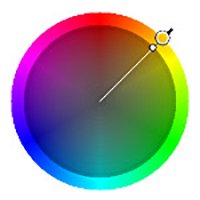

Analogous Colors: Colors that are closer by proximity in the color wheel, this is the most common color scheme and is widely used in logo design.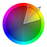

Complementary: They sit opposite to each other on the color wheel, an example blue and yellow. This combination has a “high intensity” and is used for web, graphic and logo design.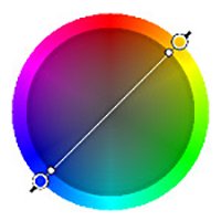

Split-Complementary: This color scheme refers to two similar colors and one opposite. This mix although risky when used well can create a rich contrast.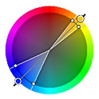
![]()
Triadic: Three colors equally spaced in the color wheel. Designers suggest to apply 60% of the same colour, then 30% and 10%. In this way, one color is predominant and the design looks more balanced.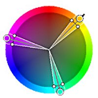

Tetradic or Double Complementary: This scheme combines two pairs of complementary colors. This is the hardest color combination to balance. Again, it’s advisable to use one color as the dominant one and the rest in small proportions.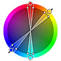

What can you expect from 48HoursLogo designers – in terms of colors?
Our experienced designers follow the basic rules of logo design, and you, in defining the design brief, do not hesitate to mention some of the following rules if you consider them as important to the concept you have conceived for your company, ie, your logo.
These few rules and things are the minimum quality you should strive for and the quality you can expect from 48HoursLogo designers!
Without mixing too many colors – but not at any cost!
As we mentioned in the article, three colors in logo design is the rule followed by most designers, however, this is not a strict rule, because sometimes a multicolor color palette can be an ingenious solution. An example is the Google logo.
Therefore, do not hesitate and give designers the freedom to experiment with colors. As a reminder, sometimes three colors can include, blue, light blue, and dark blue. Everything is a matter of concept, but also of the way of dominant application of the logo. Sometimes one color can represent a wide range if its shades are used.
Rule 60/30/10 in making a color palette
60% of the palette should be one main color, 30% of the palette should contain complementary color, and 10% of it should be an accent or shade color. This rule can be especially important for brands that strive for special sensibility, and in fact, this rule leads to shortening the color spectrum to below three.
Check the appearance of the logo in CMYK and RGB variants
Ask the designer to present you with the look of the logo in both CMYK and RGB variants. We remind you that CMYK is a color system used in print, and RGB in the digital sphere, that is, on screens.
Request a document of defined design, the so-called “logo book of standards”
In this document, the designer lists the exact colors used, the color palette in the codes, the size of the logo elements, the relationship between the text and the elements defined exactly in pixels, and so on. The basic document in a few brief lines is what you can certainly get from 48HoursLogo designers, and it can be of great importance for you in the future application of your company’s logo.
So, to conclude…
As we have seen here, a logo design shouldn’t have more than 3 colors. Too many colors may create confusion. Besides, there is always the chance of risking the design with a wide color palette.
Color is one element of design, but not the only one.
Your logo ideas should be clear and easy to digest. In order to build consistency, a predominant color must run all along with the brand. That said, many famous brands have broken those rules. Google and Ebay are some of them, in those cases, the multicolor palette works well as the fonts are evenly distributed. They use a wide color palette, but this doesn’t interfere with the brand message. You can break the rules but it has to be pleasurable to the eyes.
The most important stuff:
- keep it simple
- follow the rule of max 3 colors
- the predominant color must run all along with brand
- a multicolor palette is also an option, but 3 colors is a general recommendation

