
Your trucking company logo is the face of your brand. It needs to be memorable and representative of your company. A good logo is a way to build brand identity, trust, and make you instantly recognizable, serving as advertisement for your company while on the road.
Examples of Great Trucking Logos
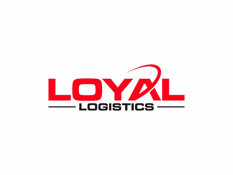
One of the most important aspects when creating a truck logo is to ensure that viewers are able to tell that your company is a trucking company. You could achieve this by making explicitly stating your services within your logo, whether by using text or adding a graphic. In Loyal Logistics’ logo, the subtitle “Logistics” communicates the company services while keeping the overall text very simple.
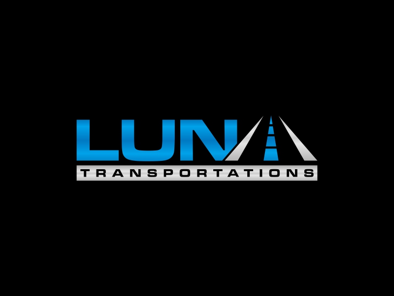
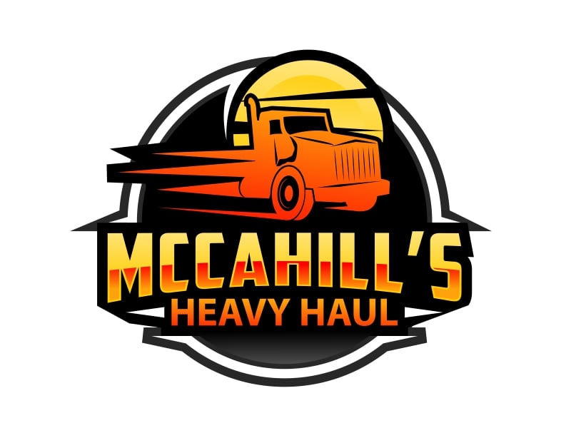
Meannwhile, the Luna Transportations logo utilizes a cheeky road graphic in replacement for the letter A. This clever letter replacement not only makes the logo more engaging to look at, it also reinforces the company’s connection to transportation and roads. Likewise, McCahill’s Heavy Haul adds a bright orange moving truck graphic, which not only grabs the eye but also communicates that it is a trucking business at first glance.
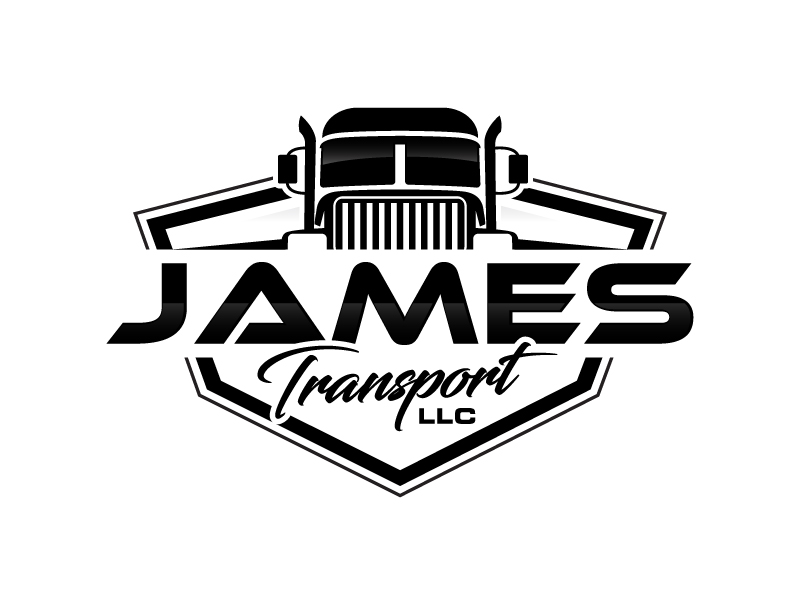
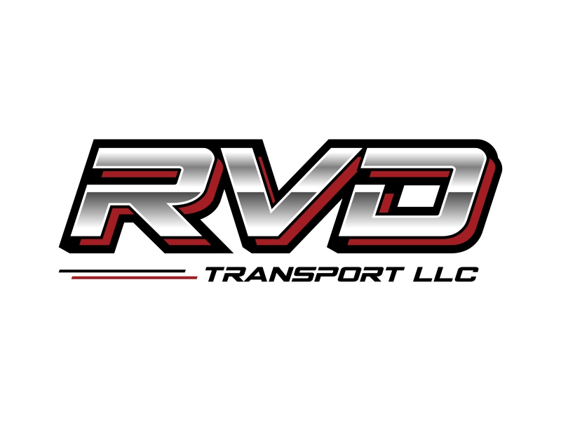
Truck companies love to use bold lettering in their logos, since it’s important for trucks sporting the logo to be visible while on the highway. RVD Transport LLC uses a bolded font to create a dynamic but concise logo. Also take into account James Transport LLC, whose simple black and white silhouette logo makes it super easy to read in all kinds of lighting.
How to Run a Truck Logo Contest
It’s super simple to use 48hourslogo logo contests for affordable, professional truck logo designs.
Ready to create a standout logo for your trucking business? With 48hoursLogo, it’s simple, affordable, and limitlessly creative. Here’s how it works:
- Submit Your Design Brief
Start by providing details about your trucking business, including your brand values, preferred colors, styles, and any specific ideas you have in mind. Also include information about the niche your business operates in. If your trucking company focuses on medical deliveries, be sure to state that clearly. The more information you give, the better our designers can bring your logo to life. - Watch the Entries Roll In
Once your contest goes live, our community of verified designers will get to work. You’ll start receiving high-quality logo submissions tailored to your brief within hours. It’s like having a team of creative professionals competing to create the perfect design for your truck brand. - Collaborate and Refine
As submissions roll in, you’re in full control. Communicate directly with designers, provide feedback, and request revisions to fine-tune the designs. This interactive process ensures you get a logo that truly represents your trucking business. - Choose Your Winning Design
Once you’ve found the perfect logo, simply pay the winning designer. You’ll receive the finalized logo files, professional add-ons (like vector files and color variations), and full copyright ownership—everything you need to start branding your business with confidence.
Why Choose 48hoursLogo?
- Fast Turnaround: Get dozens of logo concepts in just 24 hours.
- Unbeatable Value: Save up to 80% compared to traditional agencies, while receiving more proposals.
- Full Ownership: Receive all rights to your logo, so it’s 100% yours.
- Creative Freedom: Work directly with designers to refine your perfect logo.
Key elements to a Good Truck Logo
A strong trucking logo goes beyond aesthetics—it communicates your brand’s purpose and values clearly. Below are important elements to communicate with your designers when creating a logo that stands out on the road and resonates with your audience:
- Keep It Simple and Relevant
Your logo should be easy to read and instantly recognizable. Use industry-specific symbols like trucks, roads, or wheels, or include a descriptive motto (e.g., “Trucking” or “Logistics”) to convey your business at a glance. - Use Colors Strategically
Colors set the tone for your brand. Blue conveys trust, red exudes energy, and bold colors can emphasize strength. Choose a palette that aligns with your brand identity—whether it’s high-impact for heavy haul companies or minimalist for logistics firms. - Pick Scalable Fonts
Opt for bold, clean, and professional typography that works across mediums—from truck wraps to business cards. Avoid intricate fonts that lose clarity when scaled or viewed from a distance.
If you want to simulate how your logo might look on a variety of different products, use an online mockup generator to apply your logo onto hundreds of models to check yourself.
Mistakes to Avoid in Your Trucking Logo
Adding things like an overly intrinsic graphic or a barrage of colors will only make your logo harder to identify and impossible to scale onto different mediums. Take the below example; there are way too many colors and subjects, and the light yellow text makes the brand name almost impossible to read at a glance.
Being unique is also critical when developing your logo, because a logo that looks too similar to a competitor will only serve to confuse customers and dilute your brand identity. While drawing inspiration from great logos is helpful, adding your unique touch and trademarking your design ensures your brand stands out and stays protected.
Wrap Up
Your trucking company logo is more than just a design—it’s the face of your brand and a powerful tool for building your image and recognition. Focusing on simplicity, relevance, and scalability allows you to create a logo that stands out on the road. Avoid common errors like overcomplicating the design, copying competitors, or skipping copyright protection and ensure your logo is both unique and legally secure.
48hourslogo makes it easy to collaborate with a diverse pool of talented designers, whether it be for a sleek or rugged trucking company design. With a streamlined process, affordable pricing, and the ability to guide your designers through feedback and revisions, 48hourslogo takes the stress out of logo design.