In this article, we deal with a very interesting area of “massage & spa”. Massage & spa logos have their own characteristics. Here we will analyze some of them by presenting several selected “massage & spa” logo design contests from our platform.
We believe it will be equally useful and inspiring to those looking for a new logo and those making it. Enjoy!
Morning Glory Wellness & Massage
A massage & wellness (holistic) experience. That’s how the client described his business, specifying that treatments include massage therapy, yoga, and mindfulness resilience for trauma recovery.
In the design brief, it is defined that the logo should be “warm & inviting” – a “zen-like”, holistic feel. Colors are also defined. Black & white / mixed with Fuschia / lavender (healing colors).
The client received 127 creative designs to choose from.
Winning Logo Design Solution
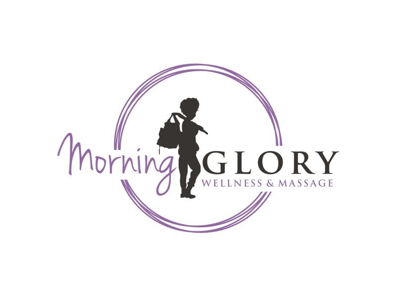
The winner was Arto moro
Very recognizable, noticeable logo. The “holistic” style line that the client mentioned in the design brief was achieved by the designer by using a circle in the required lavender shade.
The logo emits the energy of peace and rest, respite – while carrying a “call-to-action” message, which creates a great balance and has the power of good live communication.
The combination of fonts has a good function, at the same time communicating the philosophy of “relax”, but also instills confidence with the uppercase letters “GLORY”, thus representing what is called “corporate strength of the brand”. This is an important moment because it is a sensitive area of health. Healthcare web development services play a crucial role in ensuring that patients and healthcare providers have access to reliable, secure, and user-friendly platforms.
Trust is predominantly important, especially when it comes to such topics as human health and every entity in this sphere should communicate in a way that shows strength and instills trust.
The color composition is also great, non-aggressive, but very strong.
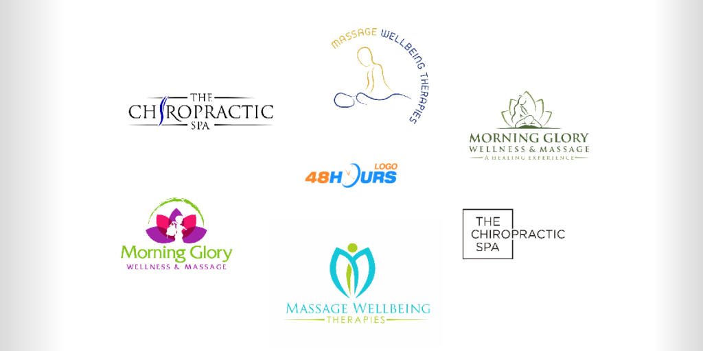
Some of the other solutions…
The Chiropractic Spa
“The Chiropractic Spa” is a Wellness Chiropractic Spa offering Chiropractic, Nutrition, Acupuncture, and Instrument Assisted Soft Tissue Mobilization, including a therapy program: Infrared Sauna, Massage Chairs, and Compression Sleeves.
In the design brief, the client highlighted that he would like the blue color to be used, stating that it should not be light blue, which is difficult to read. He also listed the elements he wants, and that is the “spine”.
“I want something we can easily make into a large marquee sign… and outdoor signage…”, the client stated in the design brief.
Quite precise instructions in the design brief increase the quality of the creative process, and clients attract more designers and get more solutions.
It is very important to use simple expressions and explain in as much detail as possible what you want. This brief is an example of this. The client received 180 creative solutions from 48HoursLogo designers.
Winning Logo Design solution
The designer that won this contest was Girly
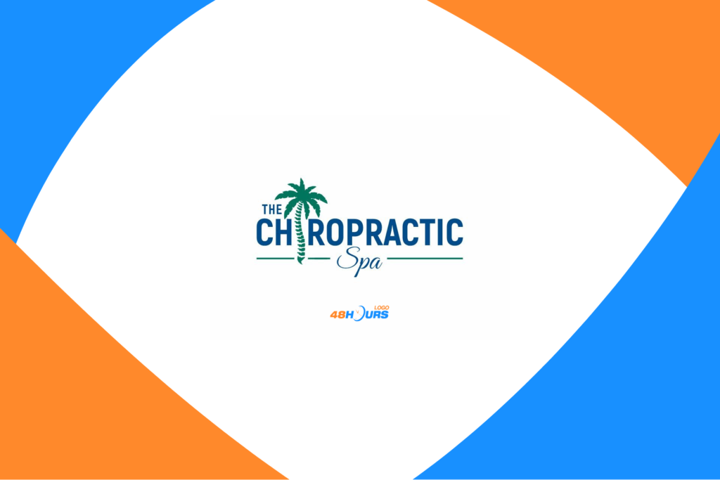
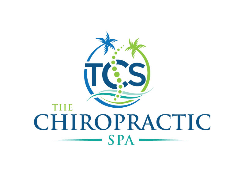
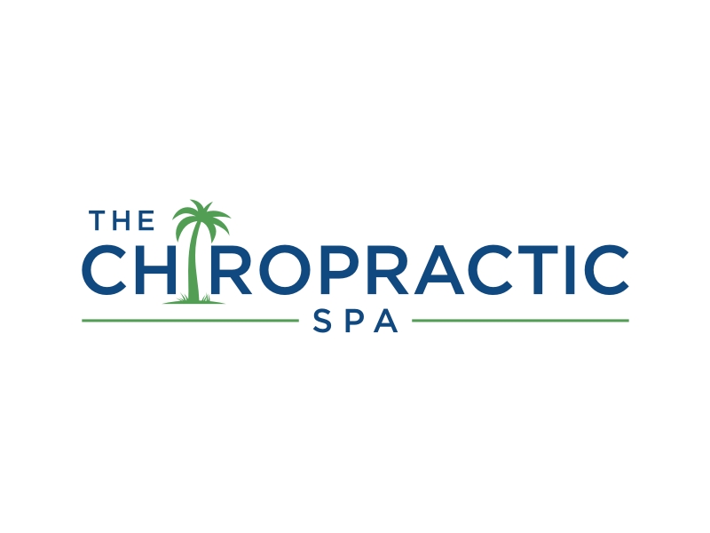
The great creative moment in the combination of the elements “spine” and “palm”! “Chiropractic” and “Spa”. The solution!
All requirements from the design brief are met, from the blue color described by the client, the elements, and so on.
The creative combination of “spine” and “palm” contains a very strong communication power and positive energy. The logo is pleasing to the eye and has resting energy.
Some of the other solutions…


Massage Wellbeing Therapies
As the company stated in the design brief, the massage is their main service, but there are also all modern services like Sauna, Hydrogen Inhalation, Hyperbaric Chamber, Lymphatic Drainage, and laser treatments.
They have new names for their business. Massage Wellbeing Therapies and Massage Wellbeing Therapies Centre. So, the client asked for variations of the logo in all layouts with either Massage Wellbeing Therapies and also Massage Wellbeing Therapies Centre.
“The logo will require to be configured so it can have variations for landscape and portrait. We will also need options for social media advertising such as a round layout as well. We will also require various formats such as jpg, and png in different sizes to suit adding to websites, social media, uniform embroidery, and print. A color spectrum needs to be supplied as well as a list of all fonts used and the fonts. All working files will need to be supplied also upon completion.”, the client wrote in the design brief.
Also, the brief brings the specifics related to the target group. A great example of a good brief addressed to designers.
In this contest, the designers uploaded 78 creative solutions from which the client chose the best.
Winning Logo Design solution

jaize is the designer who won this logo design contest.
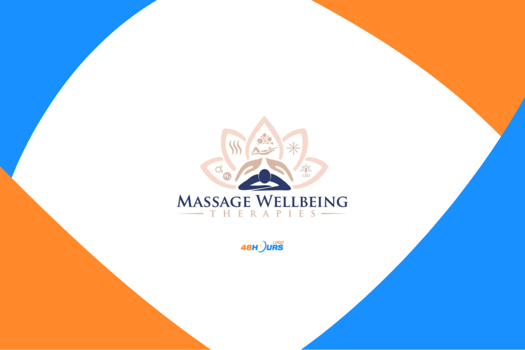
The winning logo communicates with a lot of symbols. Among other things, the client stated that he likes it when icons communicate in a smart way – “when the icon tells about the business”. This logo applies exactly that principle.
Pleasant-looking, the logo has a lot of symbols and carries information, but at the same time, it emits relaxing energy.
The logo has a good combination and composition of colors, as well as elements where a large number of symbols have been successfully reduced to a functional and non-aggressive form.
The logo is attractive and has clear communication and function, and the fonts are strong, it’s good on the level of the logo function of “building trust with users”.
Some of the other solutions…
