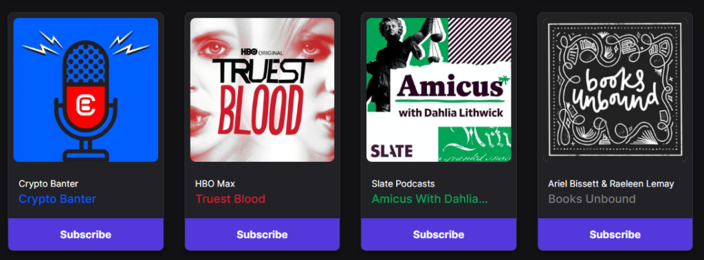
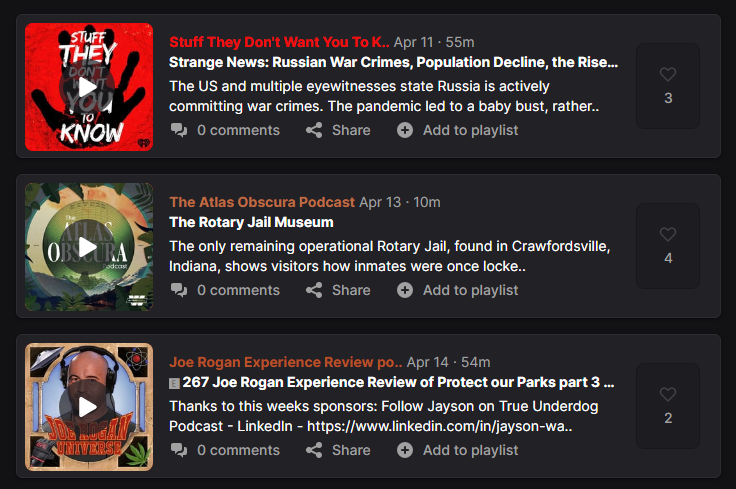
The podcast is by nature an audio brand and as much as it is contradictory, the importance of visual identity in podcasts as a platform is even greater. Audio content is a product, but visual identity is what actually communicates with the audience and what makes a podcast brand recognizable. That is why everyone who deals with podcasts must pay great attention to their visual identity.
In addition to the marketing effect, there is a technical reason, and the fact is that no distribution network will include your podcast in their network if you do not meet certain technical requirements, and one of the main requirements is graphic-visual material that must be made to exact specifications.
In this regard, the main role is played by the Apple brand as the leading stakeholder among podcast distribution networks, as Apple’s specifications have become the standard adhered to by all other networks.
Simply put, if you meet Apple standards, you will not have a problem with graphic and visual materials, that is, with the inclusion of your podcast in other distribution networks. The exact specifications and provisions are contained in the Apple Artwork Guidelines, and in this article, in addition to the topic of the most important elements of a quality podcast logo, we specifically deal with this framework and highlight the most important things you need to properly create a logo and cover art for your podcast.
Podcast Logo: This is a podcast!
As with any logo, and in the case of a podcast logo, some elements and things are crucial. With the podcast logo, one of the things that are important is that in the logo itself, it should be clearly stated that it is a podcast. Of course, no one will shoot you in the head if you don’t make it obvious, but you will definitely be a case of poor communication. So, more to be a logotype or more to be a logomark? Logotype.
Simply, you have to keep in mind that the logo of your podcast will not be shown only on podcast platforms so that it is logical and “quite clear” that it is, of course – a podcast, but that you will use and apply that logo in spheres that have nothing to do with podcasts. In such cases, it must be clear to the public that it is a podcast.
Writing the term “podcast” is the first solution that arises, regardless of whether that word and that term are part of your brand name, but the solution does not have to be exclusively writing of the term “podcast”. It can be done without it, of course. By using symbols!

The symbol most commonly used in podcast logos is the “microphone”. The symbol of the “microphone” clearly reflects that it is a podcast, in the broadest sense, that it is a radio show, but certainly, the choice of that symbol is a complete success. Also, the symbols such as speech bubbles, earphones, megaphones, etc., are all potentially good solutions. The superiority of the microphone symbol is confirmed by the popularity of this symbol in the design of the podcast logos.
The title of the podcast should be “loud and clear”!
Another important thing is the fact that podcast logos are in most cases displayed on the podcast cover arts in the directories of distributor podcast networks, and that is the form of a small square. So, it is a small space and additionally, it could be said that each cover art in these directories is crowded with many look-a-like squares.
The logo gets a tiny micro space, yes.
That is why it is important to make good use of your position in this small and not very eye-catching space, and one of the most important things is to make the title of your podcast clearly legible and visible on the logo. And also, that title should have a simple background for exact same reason.
So, wisely choose fonts and make the title big as it can be. Being recognizable and eye-catchy in the ocean of podcast brands is the goal, don’t forget that. The title plays a big role here!
The author/host on the logo and cover arts?
The stars of every podcast are their authors, so podcasts are often named after their authors. At the same time, we will agree that the authors of the podcast are the bearers of the strength of the brand of that podcast and often their faces are part of the logo and cover art of the podcast. It’s the same with their names.
The question is whether it always makes sense to put the faces and names of the podcast authors within the artwork material? Honestly, it’s too much a matter of the intimate experience of the podcast author himself, but it can be said that the thing depends a lot on the topic of the podcast itself.

If the podcast is such that it deals with a specific topic and the topic itself attracts listeners, then highlighting the author in the foreground is not a priority, although it can be a good thing because in time the author’s name will carry a certain brand strength.
On the other hand, if the podcast is thematically oriented, for example, on broad social topics, and each podcast show deals with different issues, then by its nature, the focus is on the author and host of that podcast. In that case, the author, that is, the host of the podcast, is the key factor, the one around which the whole podcast construct is built and whose skills of leading good conversations and making shows make the podcast interesting and listened to. No doubt, the name and face of the host of such a podcast have the right to have a priority place in the podcast artwork material.
In any case, as we said, the decision to use names and faces within podcast artwork material is a matter of the podcast author’s own intimate experience.
Podcast Artwork: Podcast Logo & Podcast Cover Art
In the beginning, let’s immediately clarify what “podcast artwork” is. We will be free to say that podcast artwork contains the “podcast logo” and the “cover art”.
As Apple defines it, your podcast artwork is what helps listeners visually identify your podcast and should represent the brand or logo of your show. Creating interesting and compelling artwork can help your show attract new listeners and gain new followers and subscribers.
So, podcast artwork is a graphic-visual representation of your podcast in the directories of distribution networks. It consists of the logo and the background on which the logo is located, that is, the podcast logo and the podcast cover art. Cover arts are a kind of music album covers, just for podcasts, to put it simply.
As we said at the beginning of the article, the proper creation of podcast artwork is a technical requirement of all distribution networks, and the generally accepted standard is the one established by Apple. Here are the basic highlights you need to know about Apple Artwork Guidelines.
Apple Artwork Guidelines
Artwork must be original and can’t contain any of the following:
- Blurry, misaligned, mismatched, or pixelated images
- Explicit language
- Placeholder images
- Apple Inc., Apple Podcasts, or iTunes Store logos
- The terms Apple Inc., Apple Podcasts, Apple Music, iTunes Store, or iTunes
- Visual representation of Apple hardware
- References to illegal drugs, profanity, or violence
- Ads, sponsor logos, or marketing copy
Shows
Show Cover
A successful Show Cover makes a visual impact and immediately draws in listeners with simplicity and legibility. This artwork is required.
Guidelines
- Should contain your logo and key art.
- Avoid putting important artwork elements at the bottom fifth of your image as they may be obscured by play progress, labels, or subscription offerings.
Specs
- Placement: Everywhere
- Device support: iOS, iPadOS, macOS, and tvOS
- Size: Square; 3000 x 3000 pixels. If you’re submitting your show via RSS feed, Apple Podcasts accepts show cover artwork ranging from 1400 x 1400 to 3000 x 3000 pixels. The largest size is preferred.
- File type: JPEG or PNG
Episodes
While show artwork is a requirement for all podcast submissions, episode artwork is optional and can be added only to shows submitted via an RSS feed. Episode artwork is a great way to attract new listeners. Consider creating unique images for each episode that focus on the talent or topics covered.
Specs
- Placement: Episodes
- Device support: iOS, iPadOS, and macOS
- Size: Square; 3000 x 3000 pixels. Apple Podcasts accepts episode artwork ranging from 1400 x 1400 to 3000 x 3000 pixels. The largest size is preferred.
- File type: JPEG or PNG
Channels
Channel Icon
A Channel Icon is a graphic symbol that represents your channel and is used in large and small sizes throughout the Podcasts app. Think of this as your channel’s profile pic. It is the first thing that a potential listener sees when searching for your channel. Your icon can be imagery, something abstract, or typographically based. This artwork is required.
Guidelines
- Avoid using small, detailed imagery.
- Icons should be legible at small sizes.
- Ensure the icon is centered and keep in mind that it will be cropped into a circle.
Specs
- Placement: Listen Now, Search
- Device support: iOS, iPadOS, and macOS
- Size: 3000 x 3000 pixels
- File type: JPEG or PNG
Channel Logo
A Channel Logo is delivered as a transparent PNG file. It is overlaid on either your Channel Background color selected in Apple Podcasts Connect or your Channel Background art supplied to Apple. To set your Channel Background color, enter a hex value or open the color picker and select the shade you want. A hex value is a six-digit code used to specify a color.
Guidelines
- Use horizontal logos.
- Center your logo within the template and do not extend it beyond the template.
- Lock up primary and secondary logos together in the middle of the template.
- Maximize the available template space by scaling the logo to the edge of the template.
- Be mindful of the logo color to ensure it is legible when placed onto the Channel Background. For example, do not use a white logo on a white background.
Specs
- Placement: Channel Page
- Device support: iOS, iPadOS, and macOS
- Size: 3000 x 750 pixels
- File type: transparent PNG
Subscriptions
Icon
This icon represents your subscription offering when a listener confirms their payment information while subscribing. This artwork is required.
Guidelines
- Keep the design simple and legible at small sizes.
- The design should represent the brand of your subscription offering.
Specs
- Placement: Promotional Banner, Payment screen, Active Subscriptions list, email notifications
- Device support: iOS, iPadOS, and macOS
- Size: 1080 x 1080 pixels
- File type: JPEG or PNG
Subscription Promotion
Subscription Promotion art appears when a listener tries to play content that requires a subscription, and on a channel or show pages that have subscription offerings available that a listener has not yet subscribed to.
Guidelines
- Feature the name of your subscription offering.
- Give your subscription a distinct visual branding separate from your shows and channels.
- Do not include UI overlays.
Specs
- Placement: Channel Page, Show Page
- Device support: iOS, iPadOS, and macOS
- Size: 3000 x 3000 pixels
- File type: JPEG or PNG
The templates are available on the official Apple website: https://podcasters.apple.com/support/896-artwork-requirements
