Whether you are a racing club or one of the companies that provide some kind of services in this area, there are certain laws and patterns when it comes to design in the field of racing.
In this article, we will try to present the essential things in logo design and general visual identity for companies and entities involved in racing – not omitting the fact that racing is a broad term and there are various types of racing.
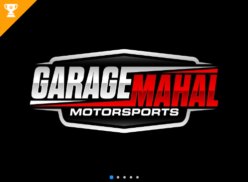
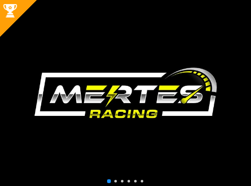
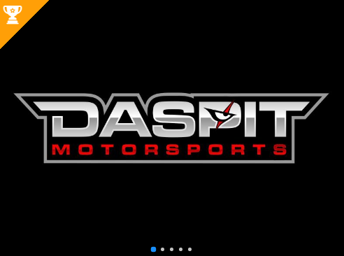
Examples of racing logo design solutions from the 48HoursLogo platform
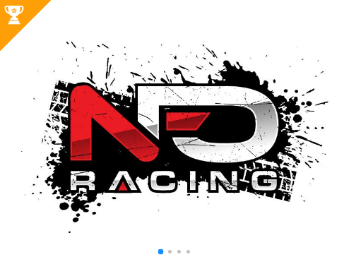
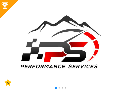
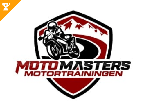
How to launch a racing logo design contest and what to write in the design brief!?
The competition in racing is great and it is not easy to stand out with a good logo. Fortunately, 48HoursLogo designers have a lot of experience with logos in this field.
In short, here is how the 48HoursLogo design contest works:
- Fill out the design brief form and send a basic explanation to our designers!
- Receive custom logo design options within minutes of launching your contest.
- As soon as a design is submitted to your contest, you can communicate with the designer by leaving a message under the design entry letting the designer know how he/she can improve.
- If you are in a hurry, you can select your finalist designer at any time. However, it’s recommended that you wait until the end of your contest and review all design submissions before selecting your finalists. During the open contest period, you can ask any designer for revisions by commenting under the design.
- Declare the contest winner and receive your logo package with everything you need to build your brand while keeping the right to ask for design revisions even after you have declared your winner.
- You get custom designs from multiple designers, the logo copyright of the winning design you choose, and professional logo files.
The first step in launching a design contest at 48HoursLogo is filling out a form on our site regarding design briefs.
Here in the article, you have a more detailed analysis of everything that makes a good racing logo and we believe it will be useful for you to give instructions to our designers in the design brief.
Pay attention to everything we have covered in this article, you will narrow down the choice and be more precise in the definition of your logo, which is an important step towards creating a good logo and defining a good visual identity.
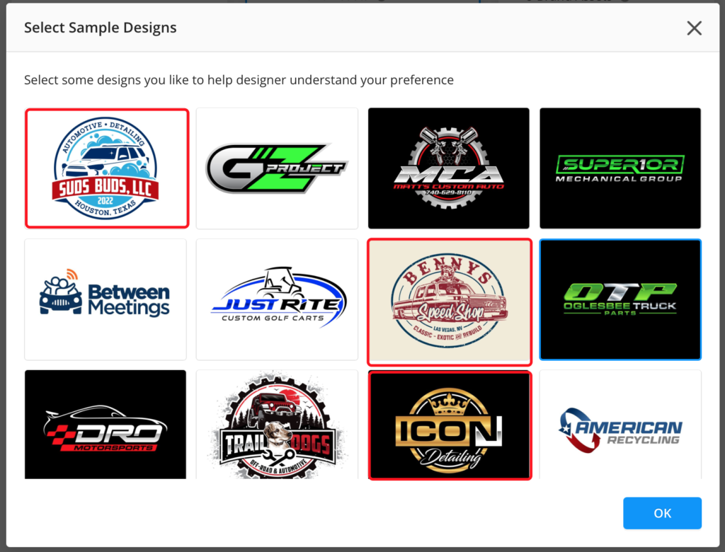
In the design brief, highlight the colors you want to be an integral part of your racing logo, think carefully about the elements you want to find within the logo, and when it comes to fonts, find similar examples on our site – this is usually easiest for customers.
A more detailed explanation of all these things – colors, fonts, logo elements – you have in the analysis below. Enjoy and good luck with the design contest for your racing logo!
Patterns of racing logo design
There are certain patterns and specific elements in racing logo design. They are about the colors, fonts, elements, and types of logos that are most common.
48HoursLogo designers have a lot of experience with this type of logo and here we will analyze the design solutions from our platform. We believe that it will be useful for both clients and designers who work on the task of creating quality logos intended for racing entities. 3, 2, 1 … go!
Colors and racing logo design
One of the colors that we can freely call the most common in racing logo design is silver, that is, metallic colors in all their variations. Whether it’s motorcycles or cars, or maybe even some more avant-garde forms of racing that include three-wheelers, quads or drones, and other more unusual vehicles, you’ll agree that it’s a bunch of attractive iron and adrenaline-fueled metal, so it’s no wonder the dominant presence these colors.
In addition to silver-metallic combinations, the use of basic simple colors is common.
These are blue, red, yellow, and not infrequently green. These are mostly colors of strong intensity, clear shades of these colors, often flashy that tend to the effect of fluorescence.
Also, the recurring pattern is the strong presence of black. It is usually a black background, but also titles that use black letters. Frequent use of elements such as racing flags in a pattern of black and white dice enhances the presence of black even more. Black is what usually reflects power, and power is an unavoidable element of good racing, hence the clear connection between black and racing logo design.
Fonts in racing logo design
The predominant font type is the so-called decorative display font type.
They are intended for logos that require the highlighting of strong and powerful titles, and clear and loud messages, and this is what racing brands by their nature demand and need.
Strong visibility, a dose of aggression, adrenaline, energy, and eye-catchy effect, these are some of the basic features of fonts used in racing logo design.
The most common elements in racing logo design
We have already mentioned the pattern of black and white dice that is common in racing, but there are some other elements that are often repeated.
These elements are sometimes used as icons and clearer geometric shapes but are often also presented as graphics and unique drawings.
The vividness and a clear emphasis on energy is a common approach in racing logo design.
We will simply list these most common elements of the racing logos:
- black and white dice
- flags
- eyes (stylized as lights)
- headlights
- wheels
- steering wheel
- exhaust pipe
- smoke
- engine
- speedometer
- helmet
- lines representing speed, wind, energy
- race tracks
- motorcycle silhouette
- silhouette of a car
Type of logo
The most common form and type of racing logo is the so-called “badge logo“. This type of logo is common in the automotive industry, but also in the field of sports. The sphere of racing just connects these two concepts.
At the same time, racing is a specific lifestyle, and badge logos carry the energy needed by community-oriented brands. Racing as an area represents a specific lifestyle and a specific community of people. Therefore, if you opt for a badge logo, you will not go wrong. This is a very common choice in racing!
What can you expect from 48HoursLogo designers!?
We offer 3 logo packages priced at $129, $199, and $299 all-inclusive. You get custom designs from multiple designers, the logo copyright of the winning design you choose, and professional logo files.
Check out our Pricing Page for more details!
Our contest duration ranges from 1 to 5 days, but logo revision can take as long as you need. If you are in a hurry, we see people complete their projects in less than 5 hours.
When a design is submitted to your contest, you can communicate with the designer by leaving a message under the design entry letting the designer know how he/she can improve.
Most of our designers are devoted to their tasks in the best possible way making clients satisfied. Clear and friendly communication is making the whole process very easy and fun.
Standard Logo Package includes:
Professional Logo Files:
- Full-Color Logo
- High-Resolution JPG
- Transparent PNG
- Vectored PDF
- Vector Source File
4 Brand Assets:
- Black & White Logo
- Design Mockups
- Color Palette/Options
- Logo Layout Options
