Retail logo designs were popular this week! We’ve rounded up the top designs from retail category from our 48hourslogo contests and broken down the strategic choices of the designers to make the clients’ ideas into a reality.

A Logo for a Natural Honey Seller
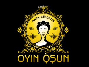
Nana Célestin’s Oyin Osun sells raw organic honey from Africa to a target audience of gourmet buyers. The product’s branding focuses on a natural feel, given the product is raw and sold in glass jars with wooden tops. The designer implemented symbols of nature (the bees within the circle and the leaves bordering the circle) to inspire a natural feel.
Another key element of the branding is the color gold, representative of the honey’s hue as well as the classy feel of the brand. The designer connected gold to the brand by using the color in the text and background of the woman (centered to showcase its importance). The gold is contrasted with a dark black, which allows the golden color to pop.

A Logo for an E-Commerce Business
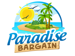
Paradise Bargain needed an e-commerce logo design reflecting their wide range of online products. Because of the large product selection, the company’s branding focuses on an overall theme rather than the products they sell. This theme is a paradise atmosphere.
The designer used color to evoke a tropical theme. Vibrant colors of blues and greens, ones you might see on a bright beach day, make up the design. Symbols of paradise are also implemented in the image, including a large sun, calm waveless sea, and palm trees offering shade.
The client wanted a “cartoony” design appealing to a sense of fun and youth. The designer used rounded images without defined edges, much like you see in a video game. The playful contrasting fonts also add to the cartoon-like feel of the design.

A Logo for a Whimsical Snack Company
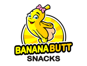
Banana Butt Snacks sells snacks, and its branding focuses on a fun and lighthearted atmosphere. The client requested a banana looking over its shoulder exposing its butt. The designer tastefully approached the design in a way that maintained the quirky vibe of the company.
To add cohesiveness to the design, the designer focused on two shades of yellow found in the banana, the text, and the striped background of the circle.
To subtly convey the lighthearted atmosphere of the company, the designer made the banana extend beyond the confines of the circle and angled part of the text. These break the norms of design, showcasing the company isn’t afraid to go beyond the norm in its whimsical branding.
As these retail companies discovered, hosting a 48hourslogo contest is a great way to get a quality design for less. If you’re ready to get several options for your company’s logo, sign up for a 48hourslogo contest today! Once you have your design, check out these 6 ways to create brand awareness with your new design.
