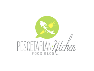
- $129
- BUDGET
- 1
- ENTRIES
BRIEF
DESIGNS (1)
- Logo Name:
- Pescetarian.Kitchen
- Company Intro:
- The logo will be for my pescetarian food blog (a pescetarian is like a vegetarian but they also eat fish - ref: http://en.wikipedia.org/wiki/Pescetarianism). The blog is called Pescetarian.Kitchen and that is the full URL as well. There is an emphasis on fresh ingredients to all of the recipes and there will be a large focus around fish/seafood recipes that incorporate fresh organic vegetables. NOTE: we are NOT a restaurant. Just a specialist food blog.
- Instructions:
- I would like a logo that is fairly minimalist and has nice tall/thin/narrow typography. Along with this should be an illustrated symbol that is either a vegetable or fish/seafood or a combination of the two. I want the logo to get across an image of being fresh, zesty and also be closely linked to fish. I want the typography to say Pescetarian.Kitchen (be sure to use the full-stop between the two words). You will see some of the ideas that I like within the sample images I've uploaded. I like the idea of the logo being a circle, but this isn't a requirement. I'm also open to it being a landscape rectangle - I'll leave that to you guys to decide. Just remember that this is a specialist food blog for pescetarians that needs to encompass all of the freshness of the food, the light pastel colours and the theme of fish/seafood in a very minimalist way.
- A
Open design concept stage had ended with 1 submissions from 1 designers. Go to DESIGNS tab to view all submissions.


Here are some helpful tips to get the most out of your design project:
1. Please leave feedback directly on the designs to guide the designers in the right direction
2. Eliminate designs that you are “not interested”
3. Please rate each design between 1 and 5 stars to help designers know your preference.
We want you to get the best possible design for your business. Thank you for choosing 48HoursLogo.com