- $120
- CUSTOM
- 1
- ENTRIES
BRIEF
DESIGNS (1)
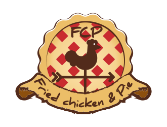
- Logo Name:
- Fried chicken & Pie - OR- FCP
- Company Intro:
- This is a blog/website which details the (mis)adventures of a stay-at-home mother and her paramedic teacher husband. <br><br>"She's the grease monkey and he's the cook."<br><br>We are NOT a restaurant. This is just the name of the blog and we will NOT concentrate on cooking either. I know, it sounds weird to us, too.
- Instructions:
- We would like to have a mid-century appearance to the logo though we don't even know what that means fully except that we like the 50s and 60s. <br>Bold colors are fine; just not black. <br><br>Go nuts. We thought about setting some parameters but would rather see just how creative the designers are in this community.
Reference Samples:


Open design concept stage had ended with 1 submissions from 1 designers. Go to DESIGNS tab to view all submissions.

