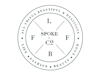
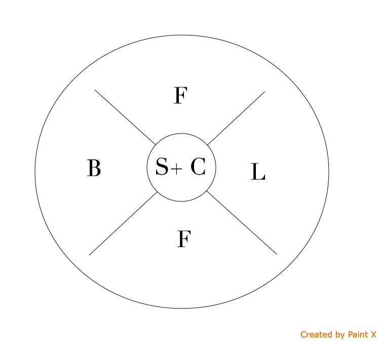
PLEASE NOTE THIS IS NOT A LOGO IT IS A GRAPHIC. A GRAPHIC WHICH EXPLAINS HOW THE WEBSITE IS SPLIT INTO 4 SEGMENTS<br><br>A website which has 4 key verticals:<br>- life<br>- beauty<br>- fashion<br>- food<br>I want this graphic to demonstrate that these 4 areas are included within the website. <br><br>This will sit in the about section as an explanation of how the site it will form the core of the website explanation and is meant as an explanation rather than a straight forward logo
PLEASE NOTE THIS IS NOT A LOGO IT IS A GRAPHIC. A GRAPHIC WHICH EXPLAINS HOW THE WEBSITE IS SPLIT INTO 4 SEGMENTS<br><br>A website which has 4 key verticals:<br>- life<br>- beauty<br>- fashion<br>- food<br>I want this graphic to demonstrate that these 4 areas are included within the website. <br><br>This will sit in the about section as an explanation of how the site it will form the core of the website explanation and is meant as an explanation rather than a straight forward logo
Instructions:
The font to use is Didot - a mixture of italic, bold capitals and ordinary font<br><br>The 'Spoke' stands for spokes on a bicycle - I like the concept of dividing a circle into segments but without looking like a bicycle<br><br>Needs to be large image 800px wide
Preview
201512220613380.jpg
Preview
201512220615180.jpg
Reference Samples:
H
henrylisette9 years ago
Rachel is just invited to join this contest!
#9 by Rachel is selected as the contest finalist!9 years ago
Design Concepts Completed9 years ago
Open design concept stage had ended with 1 submissions from 1 designers. Go to DESIGNS tab to view all submissions.


 Rachel
Rachel is just invited to join this contest!