- $129
- BUDGET
- 1
- ENTRIES
BRIEF
DESIGNS (1)
- Logo Name:
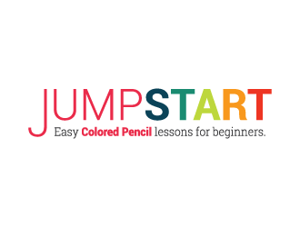
- JumpStart - tagline: Easy Colored Pencil lessons for beginners.
- Company Intro:
- We need a logo (really what we need is a masthead with a logo on it) for a new line of colored pencil project kits for beginners. This is NOT a product for kids. It's for adults wanting to learn how to draw fine art with premium colored pencil brands. <br><br>Since this logo/masthead will be on various products where the project has different colors that might clash, it would be useful to have final files where colors can be easily modifed.<br><br>Tag line is "Easy colored pencil lessons for beginners." It would help a lot if you took a look at my website to see book covers we've designed to get a sense of our taste and the look of our website. http://www.annkullberg.com. <br><br>Our demographic is mostly women 40 - 80 years old.
- Instructions:
- Contemporary - sense of fun without being too cute or too kid-like. Colors can be bold. I'm not a designer, but I came up with some ideas, all of which either look over-designed or amatuerish so I'm giving up. (ignore the bottom part of these images.) I'm usually not crazy about having a colored pencil in a logo or design. Usually looks clumsy. I think mine looks clumsy. If it could be done well, though, I'd love it. Not sure I love anything about any of the attached...but if you see a seed of an idea in any of them, go for it.
Reference Samples:


- AI must thank all who have given it a shot. Contest isn't over yet, but I know that design takes time, talent and work and I appreciate all your submissions.
Open design concept stage had ended with 1 submissions from 1 designers. Go to DESIGNS tab to view all submissions.


