- $148
- CUSTOM
- 57
- ENTRIES
BRIEF
DESIGNS (57)
- Logo Name:
- Destination Self-Reliance
- Company Intro:
- Destination Self-Reliance a website that shows people how to get back to the land. The key aspects are archery hunting, self-sufficient living through sustainable farming, and food preservation.
- Instructions:
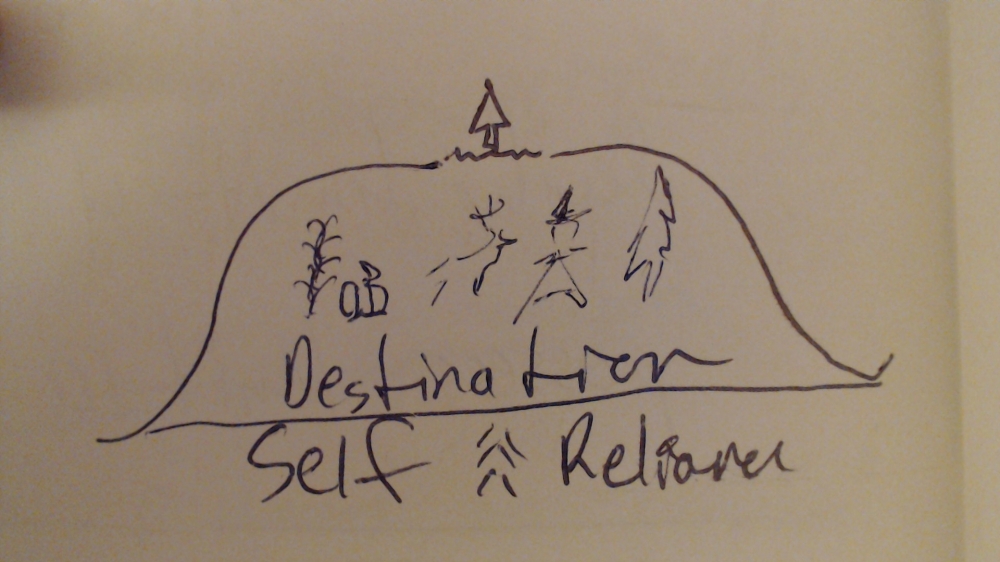
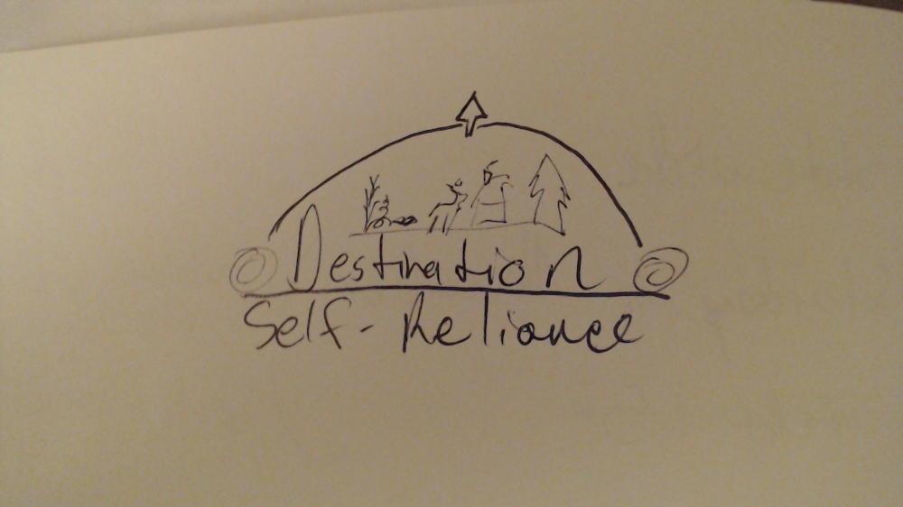
- I chose those the sample images because I like the full circle or text with arch. And I like the rustic typeface. They all have green and brown earth tones, which I like, specifically the colors of Wild Larry and Wood Chuck. Repurposed and Nothern Bounty are my favorite for text style and layout. Overall, Northern Bounty is my favorite because of the elements under the arch, similar to Hickory Hollow. I imagine a bow and arrow (compound or traditional recurve bow) with the string as the land and the bow the arch. The arrow head as the north star. Maybe some type of farmhouse with forestland, not farmland. In my first two uploaded image, there's some crops, a deer, a farmhouse/man and forest. I'm open to any suggestions and not married to my boring sketches. Another option is have the native American hunter hold the bow and arrow and use some other frame to make the circular logo. Upload 3: A drawn bow could represent a heart shape or a diamond shape. The real addition to this sort of logo would present the tree and root structure as the arrow itself with crops on one side and man and animal on the other. Cedar tree? A full circle logo or vertical oval is really my preference but I can't draw that well. Please note, my company name is long, and hyphenated. Also native-american styling is acceptable (ie traditional bow, peace pipe, feathers, cornucopia) but not necessary. The real issue to me is how to keep the text big and legible and still have some elements that symbolize my business description above. Thank you so much for your help. I'm sure you know what you're doing better than I can describe it.
Reference Samples:



- CHello, It's my first time using this site. I have two questions: Should I give feedback now or wait until I choose the finalists? Is it rude or impolite to click not interested alone, or should I leave a comment saying why? In these cases, I already know, I want to work with other designers who are closer to the mark. Any advice on how to eliminate the worst, guide the best and select the winner would help. I do see a few really good options already. Should I wait for more? thanks
 Hi good day!yes you can give comments per designer for improvement and beautification of the logo you need, yes you can eliminate also, don't worry this is a blind contest which means every designer cannot see what the other designers design,Hope this will help,Thank you
- CThank you everyone who submitted a design. It was a hard decision, but I have chosen my finalists.
Open design concept stage had ended with 57 submissions from 15 designers. Go to DESIGNS tab to view all submissions.
