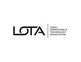
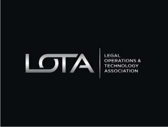
LOTA - Legal Operations and Technology Association
Company Intro:
It is a social organization where professionals join as members to network and learn from each other.
Instructions:
the logo should be based around the abbreviation: LOTA
somewhere in the logo, it should also write out the full name of the organization: Legal Operations & Technology Association
The logo should look very futuristic / "techy"
PLEASE DO NOT COPY THE EXAMPLES, PLEASE BE ORIGINAL AND CREATIVE, THANK YOU!
R-art is selected as the contest finalist!6 years ago
aisya is selected as the contest finalist!6 years ago
rahmat is selected as the contest finalist!6 years ago
Design Concepts Completed6 years ago
Open design concept stage had ended with 167 submissions from 31 designers. Go to DESIGNS tab to view all submissions.
Hi R-art, your last upload doesnt seem to have fixed the issue I was referring to. I think I was not clear, sorry. Please see the attached. I would like gaps #2 and #3 to be the same width as gap #1. Sorry for the miscommunication and thank you for the great design! I hope to use your services again in the future.
 R-art
R-art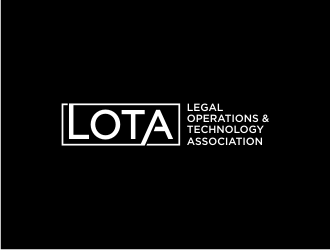
 Barkah
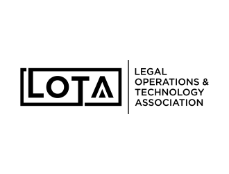
 haidar
 asyqh
asyqh
 Purwoko21
 BrainStorming
 blessings
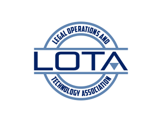
 Kruger
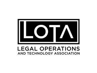
 johana
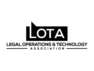
 Akhtar
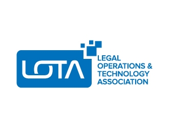
 jaize
jaize
 sodimejo
 scolessi
 pakNton
 rief
rief
 agil
agil
 evdesign
 nurul_rizkon
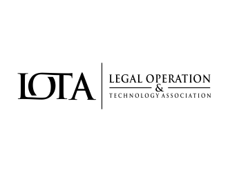
 creator_studios
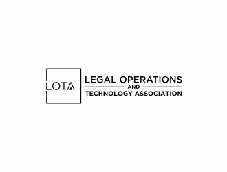
 ammad
ammad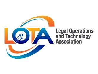
 kgcreative
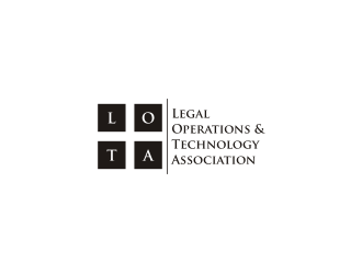
 Franky.
 checx
checx
 lexipej
 ardistic
 Dakon
Dakon
 logitec
 ElonStark
 perf8symmetry
 ndaru
ndaru