- $129
- BUDGET
- 47
- ENTRIES
BRIEF
DESIGNS (47)
- Logo Name:
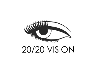
- 20/20 VISION
- Company Intro:
- THIS IS AN ANNUAL CHRISTIAN MISSIONS FESTIVAL
- Instructions:
- ÑAME, TAGLINE, and IMAGE: What we’d like is an image that is like an “eye”. And the title should be 20/20 Vision. And the tag line should be “eyes focused on the harvest”. These three elements should all be incorporated into the logo design. LAYOUT: We’d like it to be a “vertical” design, such as the image above the title, and then the tag line underneath. (Does that make sense?) COLOR: We’d like it to incorporate colors such as black, teal, and red. It doesn’t have to incorporate all three of those colours, for example it could be just black and teal. And it could be just black and red. Or it could be all three. STYLE: We’ve attached a couple of images that kind of capture the idea of an eye and 20/20 vision. However, we find them too busy, boring, and outdated. We want something that’s sleek, modern, and really draws the eye and the mind to the focus of the conference “20/20 Vision”. HOW WE WILL USE THE LOGO: The logo will be used on printed posters, printed programmes, website, social media, and will be blown up on a huge screen in PowerPoint as the title of the conference. REFERENCE IMAGES: We’ve attached three images: 1) A “busy” eye, which we’ve been trying to work with. But it just doesn’t look good. 2) A black and teal eye image which we think looks a bit more modern and could provide some inspiration. 3) A poster layout, where you can see where we’ll place the logo image, title, and tagline design (which you’re designing) in the middle of the poster.
Reference Samples:


Open design concept stage had ended with 47 submissions from 20 designers. Go to DESIGNS tab to view all submissions.
