Practice Your Training Plan for Life and Business Success
Instructions:
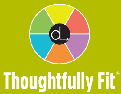
The Thoughtfully Fit Gym is an online community where people can attend "workouts" to address the hurdles and people problems that get in the way of success at work and in life.
This is NOT an actual gym. While we play with a physical fitness metaphor, we don't want people to think that this is a physical fitness program.
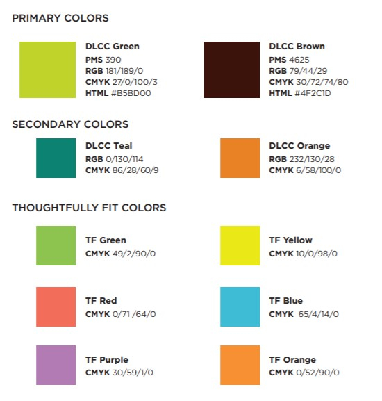
Our Thoughtfully Fit logo and color palette are attached. We went the logo to incorporate our current
branding.
All of our logos have a circle or some sort of rounded elements. We want to see that in this one as well.
Thoughtfully and Fit should have the same emphasis. (We recognize this is difficult with the different lengths of the words.)
We welcome creative ideas to help us capture our idea here and are happy to answer any questions!
Preview
TFgreensquareimage1611174266.png
Preview
colors1611174208.jpg
Preview
2021012609461471453.jpg
Reference Samples:
C
Client714533 years ago
Some additional thoughts based on the designs so far:
Thoughtfully and Fit should be styled the same way. (same font, same size)
Gym should be the word that looks special and/or stands out more. I'm thinking gym should be in a different font, color, and/or size.
Typically, we like sans serif fonts better.
The audience for this is both men and women.
Loving the creativity. Thank you!
C
Client714533 years ago
We are finding we like the designs that have all of the six TF colors (and not the secondary orange and teal colors)
C
Client714533 years ago
We are still wanting some designs that give more of a feeling of work and effort. We want more grittiness and less prettiness if that makes sense!
cintoko is selected as the contest finalist!3 years ago
nurul_rizkon is selected as the contest finalist!3 years ago
Kirito is selected as the contest finalist!3 years ago
Kirito3 years ago
#266 to #271 please. Thank you
Design Concepts Completed3 years ago
Open design concept stage had ended with 277 submissions from 55 designers. Go to DESIGNS tab to view all submissions.


 #266 to #271 please. Thank you
 nurul_rizkon
 cintoko
 Rexi_777
 drifelm
 Greenlight
 pambudi
 Foxcody
 keylogo
 MarkindDesign
 fadlan
 GETT
GETT
 NadeIlakes
 Purwoko21
 mikael
 vuunex
 zegeningen
 larasati
 cecentilan
 ElonStark
 MonkDesign
 amhik
amhik
 susanto83
 qqdesigns
 akilis13
 bombers
 afra_art
 BlessedArt
 funsdesigns
 cybil
cybil
 chumberarto
 Artomoro
 jm77788
 johana

 AthenaDesigns
 wongndeso
 my!dea
 aryamaity
 icha_icha
 GassPoll
 aflah
aflah
 ora_creative
 hopee
hopee
 KaySa
KaySa
 vostre
 cikiyunn
 HERO_art 86
 RatuCempaka
 BintangDesign
 oke2angconcept
 RIANW
RIANW
 Franky.
 tejo
tejo
 mukleyRx
 epscreation