- $101
- CUSTOM
- 1
- ENTRIES
BRIEF
DESIGNS (1)
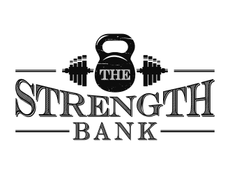
- Logo Name:
- THE STRENGTH BANK
- Company Intro:
- Fitness Industry. Personal training, consulting and gym business that uses KETTLEBELLS, TRX, Barbells etc to help clients with "retirement planning for your body" C;ients invest in moving better so they can live better. THE $TRENGTH BANK
- Instructions:
- The "The" can be very small if you want. Be creative. i am open to new ideas, but need a logo that can be printed on cards and on (black) shirts maybe. I think it might be good to incorporate a kettlebell or barbell and $ signs. Maybe a "$" instead of an S? or a $ in the kettlebell? It also might be interesting to experiment with the "Cash Money" font to make the logo look a little like a traditional bank logo
- BI'm psyched about the work so far, and excited to see more. I'm not in love with the "$B" right now. But i am open to any ideas and will give feedback quickly. I'm liking the logos that incorporate weights and kettlebells but also look more like actual bank logos.
- Bi'd still love to see something with this font: http://www.dafont.com/cash-currency.font
- Bhttps://www.google.com/search?q=vintage+kettlebell+graphic&tbm=isch&tbo=u&source=univ&sa=X&ved=0ahUKEwihkLKGh4TPAhWBdz4KHQouASUQsAQIHQ&biw=1085&bih=520#imgrc=5f_cZqds_Rxi6M:
- BI like this style: https://www.google.com/search?q=google+images+vintage+barbell+graphic&biw=1085&bih=520&source=lnms&tbm=isch&sa=X&ved=0ahUKEwikouCyhoTPAhURET4KHRvmAD0Q_AUIBigB#tbm=isch&q=vintage+barbell+graphic&imgrc=oEapWio4LI8OqM:
- BLet's get more old school with this? I think the winner may be a combination of classic graphic and classic bank font? SAMPLE GRAPHIC: https://www.google.com/search?q=vintage+barbell+graphic&biw=1085&bih=520&tbm=isch&imgil=_4VNvn0xzSwDJM%3A%3BuWNsVa11MzZKdM%3Bhttp%253A%252F%252Fthegraphicsfairy.com%252Fvintage-image-circus-silhouette-strong-man%252F&source=iu&pf=m&fir=_4VNvn0xzSwDJM%3A%2CuWNsVa11MzZKdM%2C_&usg=__5YKxB7H-Gsc4YDNE81akhNzcfxY=&ved=0ahUKEwij5P30iITPAhXH8z4KHUMyDxEQyjcIKw&ei=ZJrTV6OiPMfn-wHD5LyIAQ#imgrc=bCAHiKyuF2PRZM:
Open design concept stage had ended with 1 submissions from 1 designers. Go to DESIGNS tab to view all submissions.

