- $121
- CUSTOM
- 2
- ENTRIES
BRIEF
DESIGNS (2)
- Logo Name:
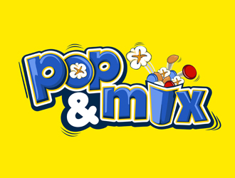
- Pop & Mix
- Company Intro:
- We are a start-up popcorn vendor company who plans to do events, shows, festivals, and fairs. Our concept is a popcorn vendor who provides a made to order concept where fair and event goers pick a type of popcorn and then go down the line in a "subway" type concept and add different ingredients to their bag like nuts, chips, candies, chocolates, and dried fruits. It's a concept that doesn't exist, which is why we need such a well put together logo to start introducing our brand! All rights reserved!!!!
- Instructions:
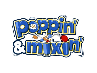
- I picked a variety of types of logos so you get a full understanding of what I am looking for. Since Pop & Mix 's concept is all about mixing popcorn with other ingredients, I envision the logo somehow incorporating the words "Pop" and "Mix" together in a logo and the name below it or by action like a popcorn kernel popping from the word "Pop" and landing in the word "Mix" using the "&" symbol as the popcorn since it kind of looks like a popped popcorn kernel (this could be where the "blending" creativity could come in and hence why I chose so many logos that uses this concept). Maybe add more flair by incorporating some other ingredients (like chocolates (M&M's) and nuts (non shelled peanuts)), This is why I picked some of the playful examples to show that I don't mind it being playful, but I'm not a big fan of different colored letters, crazy funky fonts, and an excessive amount of background noise. I'm envisioning more of a font like the Royal Splash or Granola fonts in the logos I chose (but I'm not limited to those so please be creative). I'd like a logo that is fun, playful and energetic, but is clean and not overboard, that can cleverly and clearly tell the story of who we are and what we do. Also, I would like the logo to be more horizontal and not circular shaped. This is so it's easier to throw on banners and signs and can be seen more easily from long distances. I'm envisioning more or a blue and maize color scheme, but am not limited to that either. Thanks!
Reference Samples:


- CI really like how nuts, popcorn, and candy are in the words POP here. This is for the designers where I specified this in my feedback. If you did not receive feedback about this, please disregard.
 #13, #14 is it not look like
http://www.clipartkid.com/images/272/popcorn-logo-clipart-9pi9jJ-clipart.jpg- Cyes good thing i did not pick those
Open design concept stage had ended with 2 submissions from 1 designers. Go to DESIGNS tab to view all submissions.


