- $129
- BUDGET
- 114
- ENTRIES
BRIEF
DESIGNS (114)
- Logo Name:
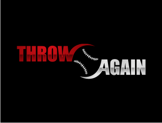
- Throw Again
- Company Intro:
- Human performance and rehabilitation services for baseball players who are sidelined by injury, throwing with pain, or who desire to maximize recovery, performance, and quality of life.
- Instructions:
- A clean, professional look is desired. Concept should include a baseball or baseball seams, that appear to mimic a recycling icon like the attached concept. Would like to see the words aligned vertically and symmetrically. Symbol can be in-between the words or stacked above the words. White, grey and turquoise on the dark background looks sharp, but also like the red, silver, and black.
Reference Samples:


- CLogo inspiration
- CWould like to see some concepts like the above but as a “reload” icon
 Because of site error recently I'm unable to submit revision you've request on my #64 entry comment. Actually it was done 12hours ago. Hope you get this message CH.
- CLooks like the site is back up now and my contest has been extended.
- CAnother potential concept is a shadow man throwing inspired by the White Sox alternate logo.
- C
Open design concept stage had ended with 114 submissions from 24 designers. Go to DESIGNS tab to view all submissions.
