- $129
- BUDGET
- 1
- ENTRIES
BRIEF
DESIGNS (1)
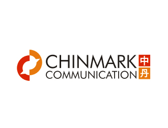
- Logo Name:
- Chinmark Communication
- Company Intro:
- Chinmark Communication is a consultancy firm that provides solutions for Danish companies that seek a better communication with and understanding of the Chinese market.
- Instructions:
- We seek a logo that is made up of two components. 1. There should be a symbol/graphical design of the Chinese characters: 中丹. These two characters should be used to make graphical design. We do not know exactly how we want it to look until we see it, but the two characters can perhaps be drawn in a special way as one symbol. 2. The second part of the logo should simply be a text saying: Chinmark Communication. The font should be minimalistic and stylish, perhaps something like Futura and Century Gothic (only example, not restriction). The whole logo must be minimalistic and stylish in its design. It must be in the same style as the concept of Danish design. The colors of the whole logo must be black, grey, white and blue (#53c8ef / CMYK: 45, 8, 3, 0). How the colors are combined is up to the designer. In general we are just seeking a cool stylish logo in a minimalistic and elegant design. We do not want to give more restrictions, as we are open for any ideas. We have uploaded some logos we think are nice logos, but we do not know exactly what we want before we see it.
- A
- CReally nice stylish logo - we would like one similar, where instead of the salamander/lizard shape there is a 中 and 丹, and under it Chinmark Communication.
- CWe have not yet found a design where we are certain - so we hope someone can sweep of our feet here in the last hours. We have uploaded a logo here that could be cool to have something similar to: we would like one similar, where instead of the salamander/lizard shape there is a 中 and 丹, and under it Chinmark
- CCool design
- CDon't mind colors - we are looking for anything now
- CAlternatively, we would also accept designs where you use the Chinese flag and write Chinmark Communication. Free color usage.
 #105pls
Open design concept stage had ended with 1 submissions from 1 designers. Go to DESIGNS tab to view all submissions.


Here are some helpful tips to get the most out of your design project:
1. Please leave feedback directly on the designs to guide the designers in the right direction
2. Eliminate designs that you are “not interested”
3. Please rate each design between 1 and 5 stars to help designers know your preference.
We want you to get the best possible design for your business. Thank you for choosing 48HoursLogo.com