- $159
- CUSTOM
- 1
- ENTRIES
BRIEF
DESIGNS (1)
- Logo Name:
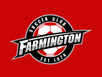
- Farmington Soccer Club
- Company Intro:
- Farmington Soccer Club (FSC) offers recreational, select and premier soccer for boys and girls in the ages of 5-18.
- Instructions:
- • modern look • unique to the area • visually interesting • Simple and easy to recognize • Club colors are Red, Black and White • Font should be clean and easily read from distance, but not boring/ordinary. Can be same/similar font to existing logo. • Two-line, text only: Farmington (top line) and Soccer Club (second line, fitting within top line) • No flames • Feel as though the shield, coat of arms, or emblem is getting overused, but this is not out of question. • Look of the logo/font should not be “trendy” • The club was established 1976 and this should be part of logo/crest. • Use of "white" color should be sparse due to potential color bleed from red jersey making white turn to pink
- CLogo will be used on playing jersey (red and white), hard goods (water bottles, sweatshirts), website, etc.
- CFor reference, we will be wearing Nike Trophy II in RED and WHITE.
- COther ideas/guidelines (I recognize this may be too late in the game)
- COther ideas/guidelines (I recognize this may be too late in the game)
- COther ideas/guidelines (I recognize this may be too late in the game)
- CThank you to everyone who participated in this exercise. This was my first experience with logo design and it was a pleasure working with all of you.
Open design concept stage had ended with 1 submissions from 1 designers. Go to DESIGNS tab to view all submissions.


