Thanks for checking this out! You're helping a nonprofit in need that supports low-income families rebuild their homes!<br><br>The mission of the CNMI CARE: “Our mission is to build a resilient community and to identify, facilitate, and deliver resources and long-term support to address the unmet needs of individuals and families impacted by disaster."<br><br>We are a nonprofit on the island of Saipan, which is a U.S. territory in the Pacific Ocean just 120 miles north of Guam. In August 2015, a devastating typhoon hit the island and destroyed a great deal of public and private property. CNMI Care was established soon after to help provide resources for people to help them bounce back from disaster (i.e., promoting resiliency). Currently, CNMI CARE is a broad network of community stakeholders working to provide resources (i.e., labor and construction materials) to assist with the island's greatest unmet need--repairing and rebuilding homes for low-income families.
Thanks for checking this out! You're helping a nonprofit in need that supports low-income families rebuild their homes!<br><br>The mission of the CNMI CARE: “Our mission is to build a resilient community and to identify, facilitate, and deliver resources and long-term support to address the unmet needs of individuals and families impacted by disaster."<br><br>We are a nonprofit on the island of Saipan, which is a U.S. territory in the Pacific Ocean just 120 miles north of Guam. In August 2015, a devastating typhoon hit the island and destroyed a great deal of public and private property. CNMI Care was established soon after to help provide resources for people to help them bounce back from disaster (i.e., promoting resiliency). Currently, CNMI CARE is a broad network of community stakeholders working to provide resources (i.e., labor and construction materials) to assist with the island's greatest unmet need--repairing and rebuilding homes for low-income families.
Instructions:
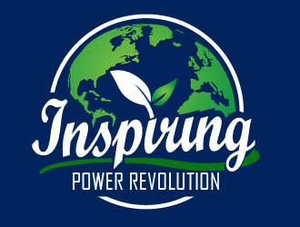
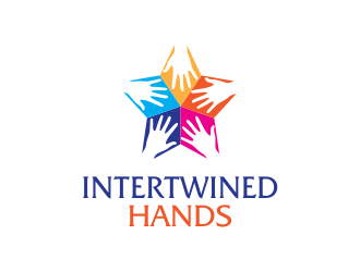
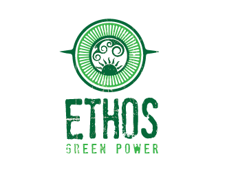
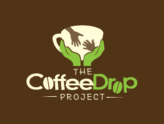
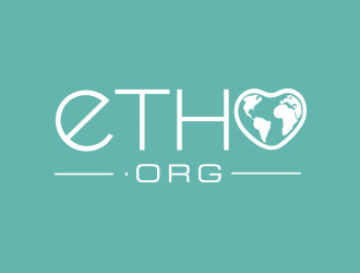
You can either go one or two routes: 1) Modify our current logo to make it much simpler and use the established symbolism, or 2) come up with a design all your own. We have a slight preference for the first option, but we're really at a lost of how we can make this happen. Top priority is to make the best product. <br><br>Style: Simple is better. We'd like people to recognize the nonprofit easily when seeing the logo. One thing we aren't a big fan of is cartoon or balloon-like fonts. We'd like something crisp and clean, but it doesn't have to be the most modern to hit the shelves (Saipan operates about 10 years behind schedule, so the people don't demand modern like they do in the states). <br><br>Color: We think we prefer blues and greens because they are island colors. We aren't overly passionate about coloring, but know that these colors would set the tone for all of our branding. We'd prefer 2-3 colors, but would entertain more if the designer thought it was best. <br><br>Symbolism: Our current logo is an image of people rebuilding a latte stone. A latte stone has great significance on the island: It represents building supports of the native people's ancestors. Latte stones are known as being the foundation of buildings, and there are still ones that are preserved to this day; this creates significance in showing strength and the ability to withstand hardships. After the typhoon, a local created the logo showing people rebuilding the latte stone. We love that symbolism, but we don't like how busy the logo looks or how clip-arty the people look. If there was a way to design the logo using the symbolism of the latte stone, distinguish it from the national flag (so people associate the logo with our nonprofit, not just Saipan), and make it simple, we would greatly appreciate it. <br><br>If the designer wanted to stray away from the current logo, we would like the image to promote this idea of strength and resiliency (e.g., a hammer, unbroken chains) or could incorporate people coming together to build a stronger tomorrow (e.g., hands). We definitely would like the designer to have creative agency here, so anything you would associate with resiliency and strength works! <br><br>Company name: CARE stands for Commonwealth Advocates for Recovery Efforts. If the designer thought it was best to incorporate the longer name, they may do so. If the designer wanted to just use CARE, they may do so. Whatever looks best. <br><br>Inspiration: As we've mentioned, feel free to use current logo and flag for inspiration. If the designer is looking to go another route, feel free to use the house/hand logo for inspiration. We also really like the sample below for Etho.org with the "O" being the world.
Preview
201606010802590.png
Preview
201606010800420.png
Preview
201606010752570.png
Reference Samples:
creative-z is selected as the contest finalist!8 years ago
scriotx is selected as the contest finalist!8 years ago
dhika is selected as the contest finalist!8 years ago
dhika8 years ago
yes sir but I still hope you will choose my design , thanks
Design Concepts Completed8 years ago
Open design concept stage had ended with 1 submissions from 1 designers. Go to DESIGNS tab to view all submissions.


 yes sir but I still hope you will choose my design , thanks
 scriotx

