A partnership between the United Westminster Schools Foundation and the Grey Coat Hospital Foundation. It has 5 schools under its umbrella (2 state schools and three independent). The Foundation provides, inter alia, a secretariat for Trustees and Governors, as well as advice to the schools and Trustees on legal, financial and other matters affecting the world of education
A partnership between the United Westminster Schools Foundation and the Grey Coat Hospital Foundation. It has 5 schools under its umbrella (2 state schools and three independent). The Foundation provides, inter alia, a secretariat for Trustees and Governors, as well as advice to the schools and Trustees on legal, financial and other matters affecting the world of education
Instructions:
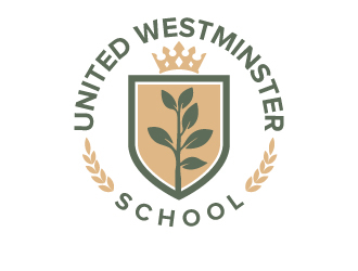
Currently Westminster Grey Coat, but looking at rebranding with a new name to United Westminster School.
Mission: Building on a strong history and excellent record of educational achievement, to strengthen this provision in both the state and independent sector in a mutually supportive and collaborative environment for the benefit of the Foundation’s pupils.
Aim: To promote broadly based educational excellence and improvement, which is financially sustainable, in each of the Foundation’s high performing schools, and to do so within the framework of a Christian ethos.
The two main strategic aims of the Foundation are to promote and pursue public benefit and to increase the influence of the Foundation.
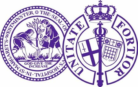
Attached is the existing ‘logo’ such as it is, which is the very traditional heraldic images of the two former Foundations, just jammed together. But they need a new, more versatile logo or their own identity.
In terms of style, the client likes simple, clean and modern and they're happy to consider abbreviations. Whilst they don’t necessarily need to hearken back to the old heraldic imagery, there should be a sense of solidity and permanence to the brand, as it has been around for 450 years after all!
Ultimately there are a number of words they feel are reflective on their brand:
Community
Heritage
Strength
Togetherness
Fonts: no particular fonts in mind, but favour modern style fonts (without looking futuristic) to the more traditional looking fonts. A site that they like uses Prompt sans-serif - so something of a similar style to this would be preferred (but please do not use the exact font).
Colours: not married to any particular colour, whatever compliments your vision for the logo design within reason)
Preview
Currentcombinedlogo1605612278.jpg
Reference Samples:
jaize is selected as the contest finalist!4 years ago
Design Concepts Completed4 years ago
Open design concept stage had ended with 65 submissions from 9 designers. Go to DESIGNS tab to view all submissions.


 jaize
jaize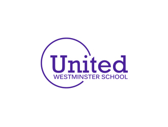
 Rexi_777
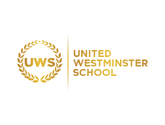
 Dhieko
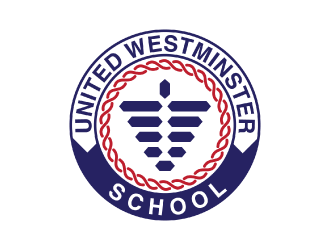
 nona
nona
 MarkindDesign
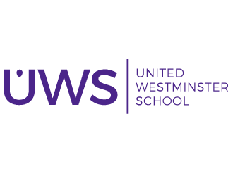
 gilkkj
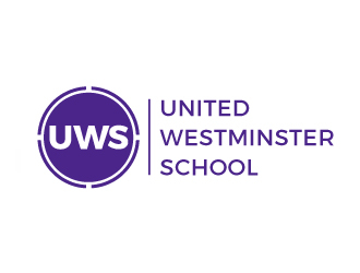
 samueljho
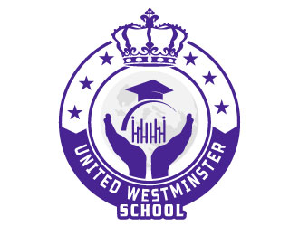
 Suvendu
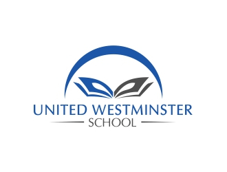
 DMC_Studio